How to Create a top and bottom Sticky View in SwiftUI

SwiftUI offers a flexible way to create views on iOS. In today's blog post, we are going to look at how to create a sticky view accompanied by a scrolling counterpart on iOS using SwiftUI APIs.
A sticky view is any view that sticks either at the very top or bottom and allows the view below or above it to scroll respectively.
Applications of Sticky View
The sticky view can be used in cases where you want users to scroll through the long content, but are still able to fix the button or content that the user always sees. For example, the booking button, checkout button, or the top promotional banner.
Creating a Sticky View
To create a sticky view, we need two components
- Scroll view
- Sticky view attached to scroll view
But we cannot put everything in the scroll view, so we need to embed a vertical stack inside it to be able to stack heterogenous views together.
We also need to use an external vertical stack view which will embed a scroll view and then a sticky view at the bottom (Or top depending on our use case)
With this understanding, our view hierarchy will look something like this with a sticky view at the bottom,
VStack
- ScrollView
- VStack
-View
-View
....
..
- Sticky View
Alternatively, if you want to stick the view at the top, you can tweak the hierarchy like this,
VStack
- Sticky View
- ScrollView
- VStack
-View
-View
....
..
Implementation
Now that we know the hierarchy, let's start implementing it in SwiftUI. We will show the random items in the list embedded inside the scroll view.
In order to get a better understanding of how items are lined up, we will color them with a suitable background color.
import SwiftUI

struct StickyView: View {

    private let items = (1...50).map { "Item \($0)" }

    var body: some View {
        VStack(spacing: 0) {
            ScrollView(showsIndicators: false) {
                VStack(spacing: 0) {
                    ForEach(items, id: \.self) { itemName in
                        Text(itemName)
                    }
                }
                .background(.red)
            }
            Button {

            } label: {
                Text("Add to Cart")
            }
            .background(.yellow)
        }
    }
}
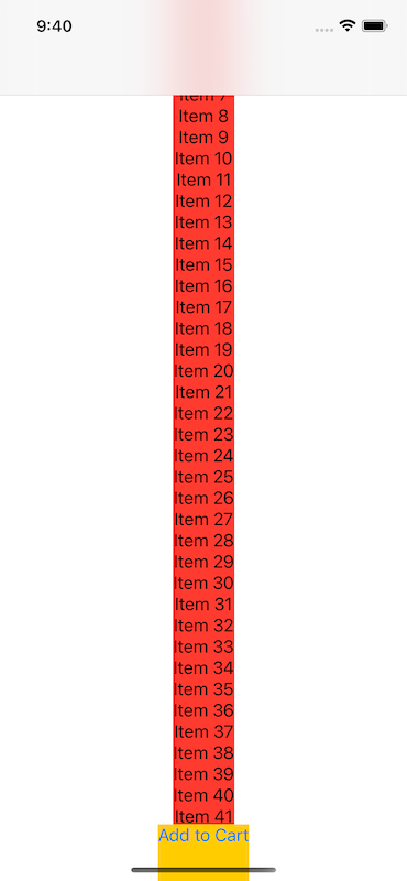
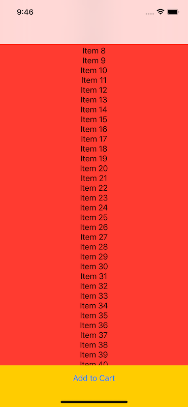
As you can see views are properly laid out, but they do not utilize the full width which makes the UI look awkward. We will set views' maxWidth to infinity to fully stretch to the available width. We will apply this modifier to internal VStack and sticky views.
We will also add default padding around the sticky view for better UI. With these final changes, our UI will look like this.
I am not going into details about how to stick the view on the top of the scroll view. Please refer to the view hierarchy above to change the layout and move the sticky view to the top.
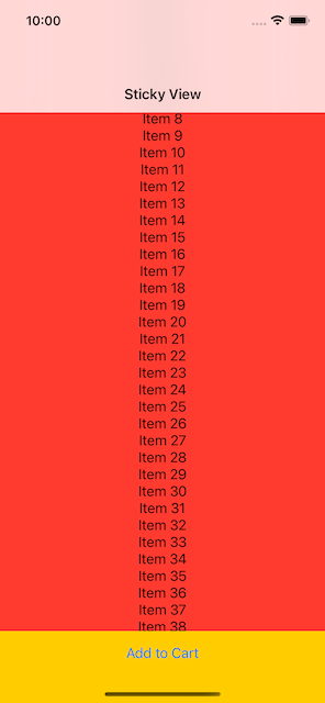
Adding Navigation Bar
To make it look even better, we will embed it inside the NavigationView with a title and inline display.
var body: some View {
    NavigationStack {
        VStack(spacing: 0) {
            VStack(spacing: 0) {
                ScrollView(showsIndicators: false) {
                    VStack(spacing: 0) {
                        ForEach(items, id: \.self) { itemName in
                            Text(itemName)
                        }
                    }
                    .frame(maxWidth: .infinity)
                    .background(.red)
                }
                Button {

                } label: {
                    Text("Add to Cart")
                }
                .padding()
                .frame(maxWidth: .infinity)
                .background(.yellow)
            }
        }
        .navigationTitle("Sticky View")
        .navigationBarTitleDisplayMode(.inline)
    }
}
If you simply wanted to know how to create a sticky top / bottom view in SwiftUI, you can stop here. If you want to know how to create a generic sticky view that can embed any sticky or scrollable content, please read on.
Creating a Generic Sticky Component with Scrollable Content
What we did so was good, but not good enough. This was specific to one case, but what if you want to add custom scrollable and sticky content? We will build the generic scrollable + sticky content view which can accommodate any content type.
Our Generic component will take the following parameters which can be customized during initialization.
- Title
- Scrollable content
- Sticky content
- Stick position (Top or bottom)
Now, let's refactor our original code to use these customized parameters and get rid of lines that we no longer need, such as background colors used for debugging.
We will use @ViewBuilder annotation to pass custom views in the component initializer
import SwiftUI

struct ScrollableViewWithStickyComponentView<ScrollableContent: View, StickyView: View>: View {

    enum StickPosition {
        case top
        case bottom
    }

    private let title: String
    private let scrollableContent: ScrollableContent
    private let stickyView: StickyView
    private let stickPosition: StickPosition

    init(title: String, @ViewBuilder scrollableContent: () -> ScrollableContent, @ViewBuilder stickyView: () -> StickyView, stickPosition: StickPosition) {
        self.title = title
        self.scrollableContent = scrollableContent()
        self.stickyView = stickyView()
        self.stickPosition = stickPosition
    }

    var body: some View {
        NavigationStack {
            VStack(spacing: 0) {
                VStack(spacing: 0) {
                    if stickPosition == .top {
                        stickyView
                            .frame(maxWidth: .infinity)
                    }
                    ScrollView(showsIndicators: false) {
                        VStack(spacing: 0) {
                            scrollableContent
                        }
                        .frame(maxWidth: .infinity)
                    }
                    if stickPosition == .bottom {
                        stickyView
                            .frame(maxWidth: .infinity)
                    }
                }
            }
            .navigationTitle(title)
            .navigationBarTitleDisplayMode(.inline)
        }
    }
}
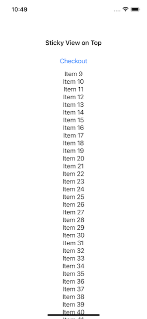
Now that our generic version is ready, let's start spinning out some views with scrollable content and a sticky view on the top and the bottom.
let items = (1...50).map { "Item \($0)" }

var body: some View {
    ScrollableViewWithStickyComponentView(title: "Sticky View on Top", scrollableContent: {
        ForEach(items, id: \.self) { itemName in
            Text(itemName)
        }
    }, stickyView: {
        Button(action: {

        }, label: {
            Text("Checkout")
        })
    }, stickPosition: .top)
}
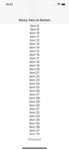
let items = (1...50).map { "Item \($0)" }

var body: some View {
    ScrollableViewWithStickyComponentView(title: "Sticky View on Bottom", scrollableContent: {
        ForEach(items, id: \.self) { itemName in
            Text(itemName)
        }
    }, stickyView: {
        Button(action: {

        }, label: {
            Text("Checkout")
        })
        .padding()
    }, stickPosition: .bottom)
}
Summary
So this is all for today. I hope this article was useful to you for understanding sticky view and its combination with scrollable content to build generic views in SwiftUI. Have you encountered similar situations in your app? Do you have any idea about extending the current implementation? Do you see any issues and want to build improvements on top of the existing code? Please let me know. I would love to hear your thoughts and suggestions.
Support and Feedback
If you have any comments or questions, please feel free to reach out to me on LinkedIn.
If you like my blog content and wish to keep me going, please consider donating on Buy Me a Coffee or Patreon. Help, in any form or amount, is highly appreciated and it's a big motivation to keep me writing more articles like this.
Consulting Services
I also provide a few consulting services on Topmate.io, and you can reach out to me there too. These services include,