CSS brand logos!

CSS stands for Cascading Style Sheets. It is a style sheet language used for describing the presentation of a document written in a markup language like HTML. From Wikipedia. I first learned CSS at the age of 16. However, it took me 8 years until I could completely understand its potential. After I got more comfortable with it, I started making some logos and random graphics with it. This post lists some of my creations made using CSS.
I do not own or hold copyright of any of the logos I am going to demonstrate in this post. This is just for the demonstrative and educational purpose to show the potential of CSS and with enough knowledge how one can make wonderful things out of it.
I have arranged all this creations in increasing order of their dates of creation. Some of the old ones go as back as 2014 to the newest ones which have been created just yesterday. With each logo, I have provided a brief description, history - if applicable, and side-by-side comparison of original logo vs. the one that was created using CSS.
- Android
This was my very first creation using CSS. I got the idea of this work from one of the tweets I saw earlier. Challenging thing was to add extra animation to support blinking of eyes and moving hands, head and legs.
Also, this is animated if you want to directly interact with it!


2. DuetHealth
I was working for DuetHealth from 2013-2016 - A Columbus based software products company specializing in healthcare domain. As with most of the work here, it was done over one weekend when I loved our new logo and thought it's a great opportunity to re-create it in CSS

3. Wayfair
Made a CSS artwork for Wayfair shortly after I began my new job by the end of 2016. It was far slightly more challenging work with so many elements involved, but also more straightforward due to orderliness and use of deterministic architectural structure. I also wrote a blog post about Making Wayfair logo with CSS for more insight.
4. Microsoft
Not my favorite company, but quite easy to make to make a logo for. It was created just this last Saturday. I used this awesome color picker from image to pick right colors. Very simple indeed - straight lines, 4 squares and a title.
5. Chase
This too was created on the same day as previous logo. After finishing work as easy as Microsoft, creating this one was little bit tedious. Problem was adding appropriate shape that matches with original designs, curves and exact triangular shape that is observed at the end. Finally arranging them together took bit of trial and error with occasional rotation and translation.
6. Mitsubishi
This logo wins the award of being the easiest to create. Just three red-colored triangles with some rotation and translation. The only thing missing is that it does not exactly match with the font of original logo.
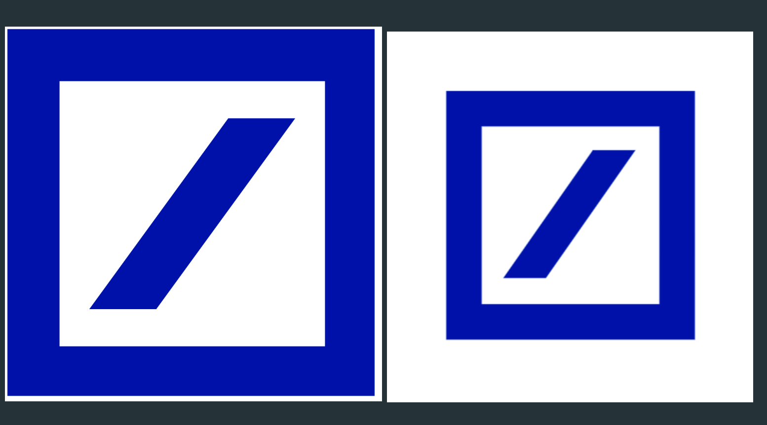
7. Deutsche Bank
Next comes another bank, A Deutsche Bank. As I made research into it, I realized "official" logo does not have any text into it. It made it much easier to create this logo as adding text to CSS element adds another level of complexity.
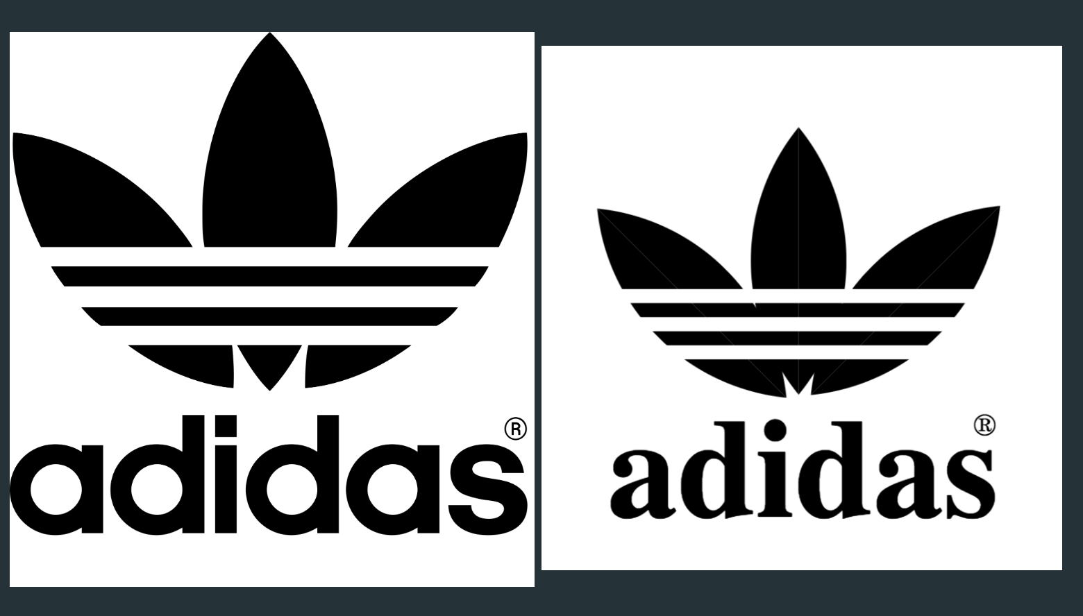
8. Adidas
This was another beast to kill. I began work on Adidas logo on Sunday and I was in clouds due to my successful work on rest of the logos on Saturday. However, it wasn't that easy. First I had to create that leaf shape which I had almost given up until I came across less-known clip property in CSS. Once it was done, remaining work was create 3 identical shapes and apply some rotations + translations. Next I created three horizontal white strips (Just seconds' worth of work) to overlay them on the top of these leafs and done! It took me 48 hours + countless other moments to come up with the solution.
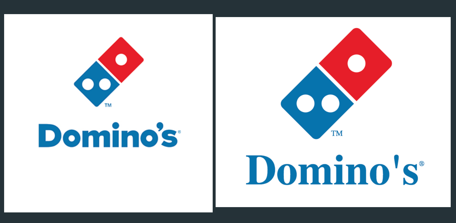
9. Domino's
There was one time I used to love Domino's pizza, but nowadays I keep that reference just to create CSS artwork. After conquering Adidas, I thought I could convert any logo into CSS. This too was structured and made mostly of simple lines and some circles. Just like other logos, once base elements were constructed, remaining work was just re-arranging them to create a meaningful image.
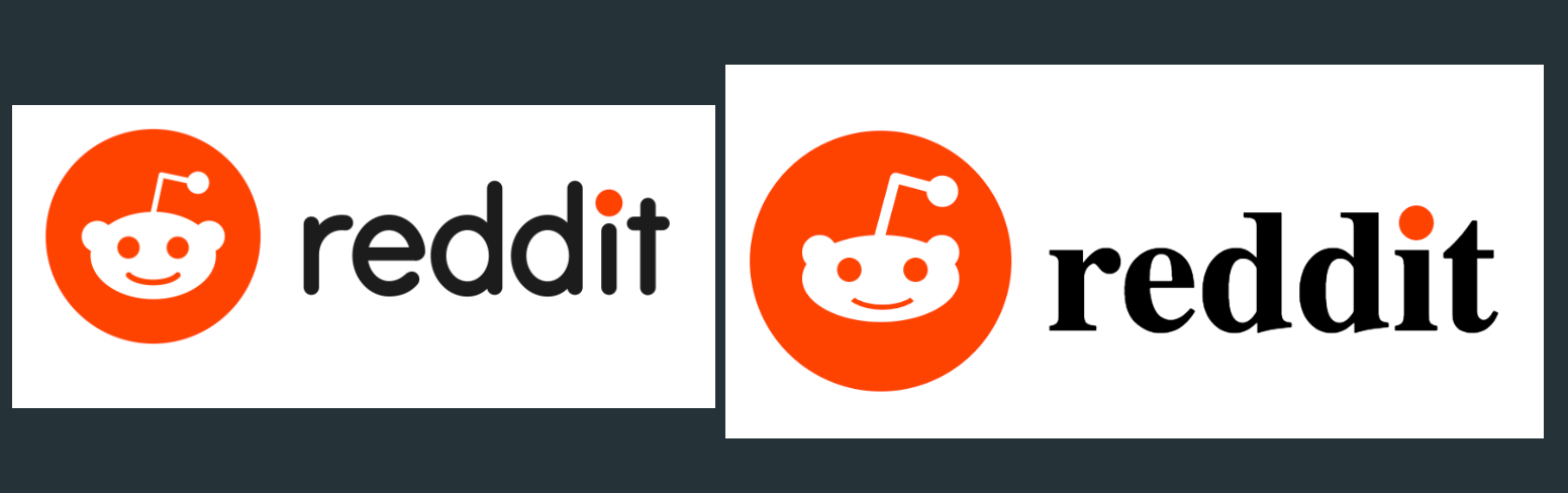
10. Reddit
And finally we reach to the last of logo from this series. This is freshly baked just created last night. Although structurally logical, it still had bunch of elements which was frustrating. I guess it's ok since this is a face and we need some features. Major challenge was making that Reddit face smile just as the original one. Slight variation and it will no longer be the Reddit logo. Hopefully I didn't screw it up. By the way, love that antenna on the top!
Before I conclude the post, I need your help if you've been using CSS for long time and consider yourself to be proficient using some advanced features. Most of my code is crude and feels kind of forced. I would love your opinion on how it can be improved by writing clean structure and getting rid of boilerplate code. You can make a comment or reach out to me directly on Twitter at handle @jayeshkawli