Custom Alignments in SwiftUI

SwiftUI offers a novel way to lay out views in iOS apps. Unlike an explicit constraint system where you clearly specify how you want to layout views with respect to each other's leading, trailing, or center edges, SwiftUI offers a more subtle way to arrange views instead of going into too many details.
This works for most cases but also fails when you want to lay out views by stating explicit conditions such as aligning the centers of these two views or aligning the baseline of one view with the top of another view. Things become complicated when they are part of the same view hierarchy, but have different immediate parents.
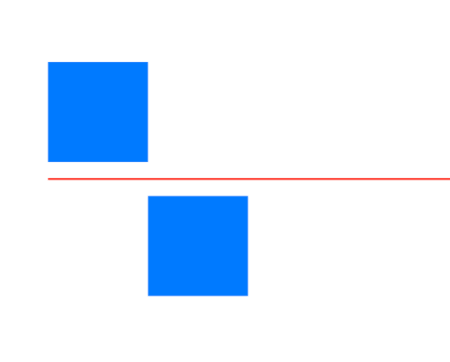
Custom alignments in SwiftUI offer elegant and reliable solutions in such cases. They allow developers to specify a fixed line and then lay out views relative to that line. For example, consider the fixed line like this and two views around it.
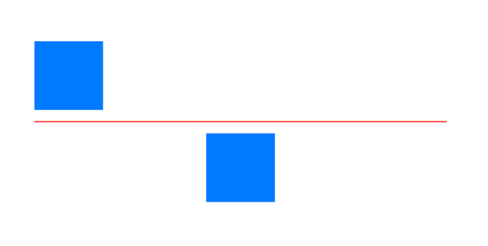
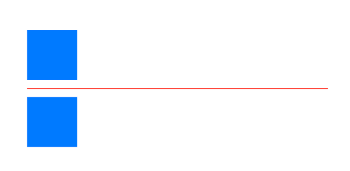
In SwiftUI, I can't align the horizontal centers of these two views directly, but with custom alignment, I can specify the fixed center and ask both of them to align their horizontal centers. That way they don't have to know about each other, but as long as there is a fixed third reference (In this case, a red line), their positions relative to each other will match.
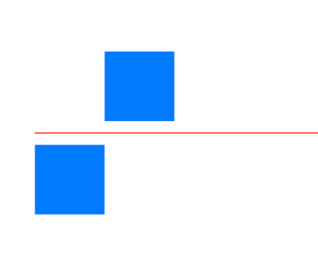
Similarly, I can customize the layout in such a way that, I can also match the leading edge of one view with the trailing edge of another and vice versa.
Custom alignments in SwiftUI offer flexibility to create complex layouts like this. This may not look like too much work when considered a manual constraint system, but in SwiftUI, where implicit is valued more over explicit, things like this become more tricky and frustrating to implement.
struct CustomAlignment: View {
    var body: some View {
        HStack {
            VStack {
                Text("Top Leading Text\nAnother line")
                    .border(Color.red, width: 1.0)
                    .padding(.all, 8)

                Text("Bottom Leading")
                    .border(Color.blue, width: 1.0)

            }
            .border(Color.yellow, width: 1.0)

            Rectangle()
                .fill(Color.black)
                .frame(height: 1)

            VStack {
                Text("Top Trailing Text\nAnother line")
                    .border(Color.red, width: 1.0)
                    .padding(.all, 8)

                Text("Bottom Trailing")
                    .border(Color.blue, width: 1.0)

            }
            .border(Color.yellow, width: 1.0)

        }
        .padding()
        .border(Color.black, width: 1.0)
    }
}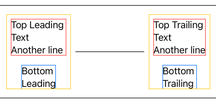
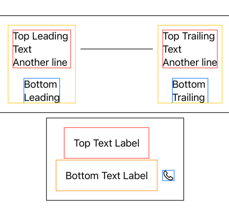
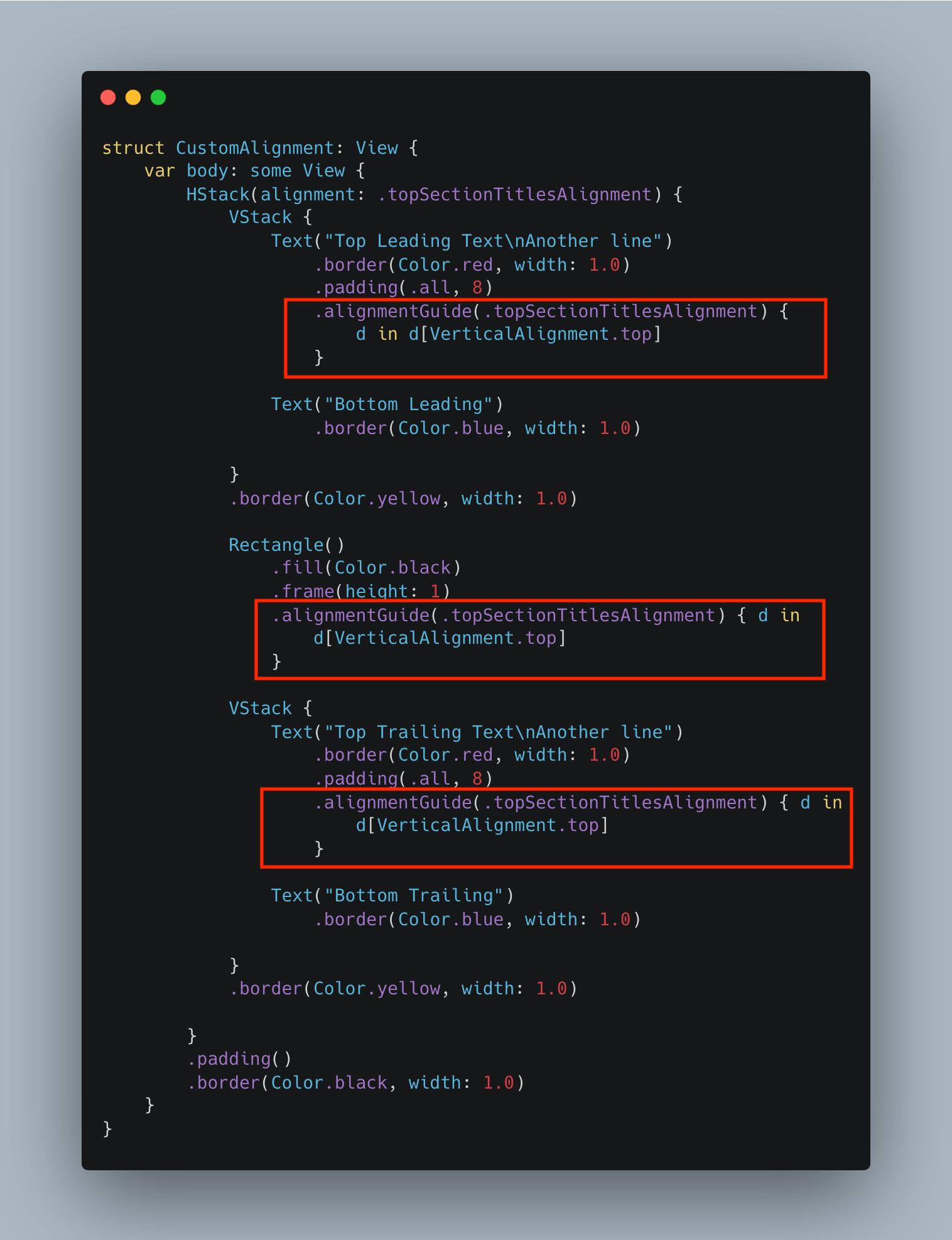
If you look at the view from the very top, there is an enclosing parent HStack view with a black border. Inside it, there are two VStack children (With a yellow border) one on each side. Inside each VStack, there are two Text elements - One with a red border and the other with blue.
Between these two VStacks, there is a horizontal rule. This is a default layout for this view. However, the designer wants us to align the horizontal rule with text with a red border.
It would've been very each if they were part of the same HStack and we could easily align their vertical centers. In this situation, however, Texts are part of different parents and the horizontal rule has its own parent.
To vertically align these 2 Texts and the horizontal line, we will make use of a custom alignment. Below are steps you can follow to create and use custom alignment in the given view hierarchy.
Creating a Custom Alignment Struct
Custom alignments are passed to child views from the parent through its own alignment parameter. Since the top-level HStack encloses this view hierarchy, we will first pass the custom-made VerticalAlignment in its initializer.
extension VerticalAlignment {

    // A custom vertical alignment to custom align views vertically
    private struct TopSectionTitlesAlignment: AlignmentID {
        static func defaultValue(in context: ViewDimensions) -> CGFloat {
            // Default to center alignment if no guides are set
            context[HorizontalAlignment.center]
        }
    }

    static let topSectionTitlesAlignment = VerticalAlignment(TopSectionTitlesAlignment.self)
}
We extended the VerticalAlignment struct and overridden the existing defaultValue method to provide our own custom alignment. If no guides are set, we default to center alignment for the newly created TopSectionTitlesAlignment custom alignment.
Using the Custom Alignment to Vertically Align Views with Different Parents
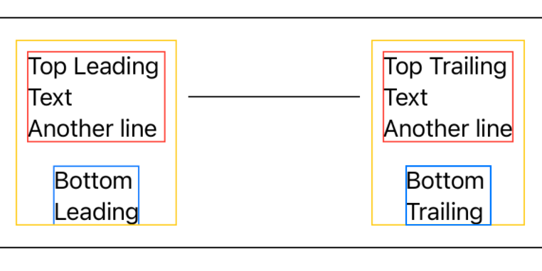
Now that our custom vertical alignment is ready, we will use it to vertically align the centers of the horizontal rule and two `Text `objects belonging to two VStack parents. Essentially, this custom alignment is nothing but a reference line and acts as an anchor for all 3 views. We will first pass it as an .alignment attribute to the top parent HStack and align the centers of all 3 views with the center of this alignment. That way we get a final view where all these elements are vertically aligned to each other in terms of their respective centers.
In order to align centers, we are going to use the following API,
alignmentGuide(.<custom_alignment_name>) { d in
    d[VerticalAlignment.center]
}
That way, we are asking elements to use this custom alignment as a guide and align the centers of our views on this guide. We are going to do this for all 3 above views,
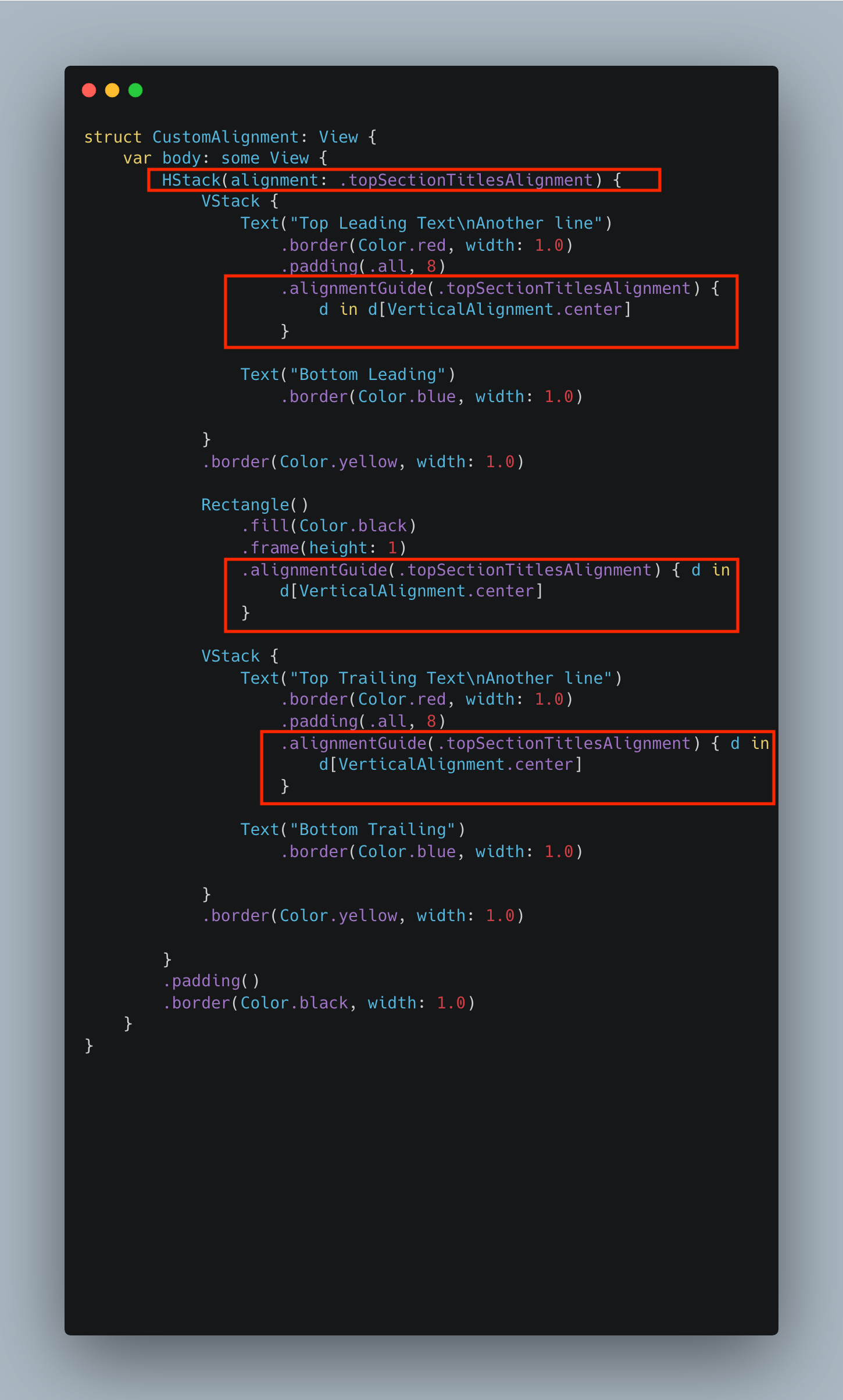
As you see in the above code, we are passing our custom alignment to the top-level HStack view and also aligning the centers of two Text views and a horizontal separator with it.
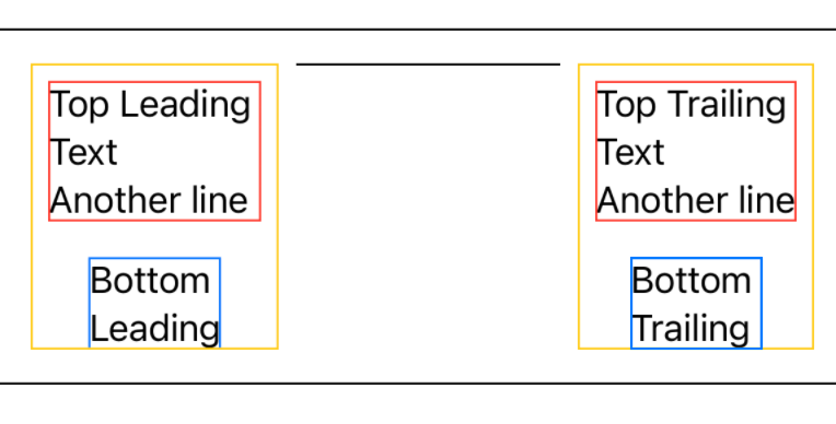
Now, if the product comes tomorrow and asks us to change the layout such that the horizontal divider should align with the top or bottom of the text view, we can do this with just a few lines of code.
Aligning Separator with Top of Text Views
To align the top of all views, we will update alignmentGuide of all 3 views from .center to .top.
Aligning Separator with Bottom of Text Views
To align the bottom of all views, we will update alignmentGuide of all 3 views from .center to .bottom.

Horizontally Align Two Views with Custom Alignment
In the previous example, we saw how to vertically align multiple views using custom alignment. In the next example, we will see how to horizontally align multiple views using the custom alignment.
Let's say, we are working on a view like this,
struct CustomAlignment: View {
    var body: some View {
        VStack {
            Text("Top Text Label")
                .padding()
                .border(Color.red, width: 1.0)
            HStack {
                Text("Bottom Text Label")
                    .padding()
                    .border(Color.orange, width: 1.0)
                Image(systemName: "phone")
                    .border(Color.blue, width: 1.0)
            }
        }.padding().border(Color.black, width: 1.0)
    }
}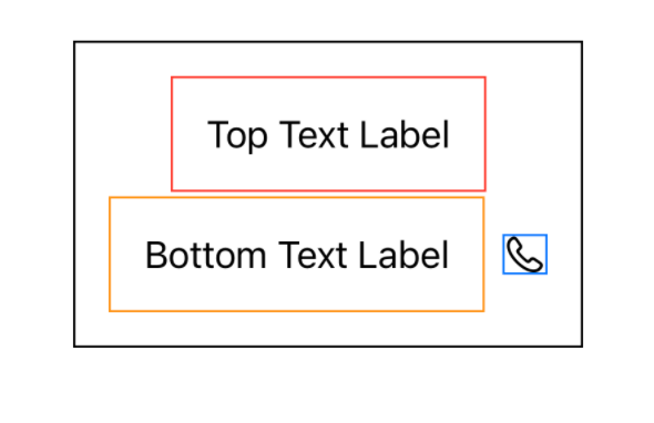
All of a sudden the product manager arrives and asks us to modify this view so that the horizontal centers of the top and bottom text labels are aligned. In general, it would have been easy, but since they are part of different immediate parents, we will use custom alignments to center them horizontally.
Creating a Custom Alignment Struct
Since we want to horizontally align these two views, we will use the custom horizontal alignment. Let's start with extending HorizontalAlignment and creating a new custom alignment struct named CustomHorizontalAlignment.
extension HorizontalAlignment {

    // A custom horizontal alignment to custom align views horizontally
    private struct CustomHorizontalAlignment: AlignmentID {
        static func defaultValue(in context: ViewDimensions) -> CGFloat {
            // Default to center alignment if no guides are set
            context[VerticalAlignment.center]
        }
    }

    static let customHorizontalAlignment = HorizontalAlignment(CustomHorizontalAlignment.self)
}
Passing Custom Horizontal Alignment to VStack and Using it to Horizontally Align Subviews
Now that the custom alignment is ready, we will pass it to the top-level VStack. Since we want to horizontally center top and bottom text labels, we will use alignmentGuide API on them just like the previous example but using HorizontalAlignment.center key on dimension.
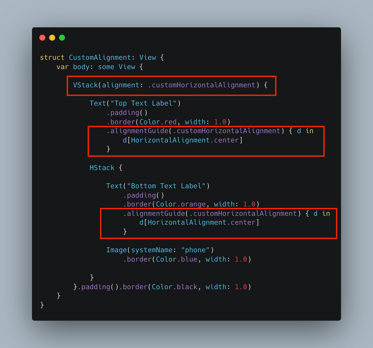
And our view is ready!
In a similar way, you can align either their leading or trailing edge by passing respective keys .leading or .trailing in the ViewDimension.
Summary
So this was all about using custom alignments in SwiftUI. Although SwiftUI does not explicitly let us specify view positions, custom alignment is its powerful feature to add flexibility to how views are aligned. Just with a few lines of code, you can align the top, bottom, leading, or trailing edges of sibling views any way you want.
If you are new to SwiftUI, I would strongly recommend you to practice with it. If you're a frequent SwiftUI developer, chances are you will run into custom alignments use-case sooner or later.
Let me know how you liked the blog post or have any feedback or comments about it.
Source code
A full source of this tutorial is available on Github in a gist format to view and download for free. Feel free to comment or suggest an improvement. I am more than happy to hear from you.