How to add Rounded Corners, Rounded Borders, and Shadows to SwiftUI views

SwiftUI offers a convenient and quick way to design UI elements for your iOS app. However, some things in SwiftUI are more complicated than UIKit. In today's blog post, we are going to look at one such feature and learn how to add rounded corners, rounded borders, and shadows to SwiftUI view.
This is a frequent use case when you're developing UI elements and I hope this short blog post will give you quick tips on how to design these elements for the given SwiftUI view instance without much hassle.
- Adding rounded corners
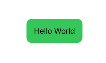
To add rounded corners to a given view, we will use RoundedRectangle API. To this API, we will pass the corner radius, and optionally pass the fill color to fill the background color of the input view
struct RoundedCornerWithShadow: View {
    var body: some View {
        Text("Hello World")
            .padding()
            .background(
                RoundedRectangle(cornerRadius: 12)
                    .fill(Color.green)
            )
    }
}
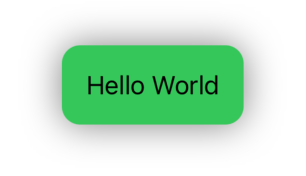
2. Adding a Shadow
In the second part, we will add a shadow to our view. We will use shadow modifier on the view passing shadow radius and color.
struct RoundedCornerWithShadow: View {
    var body: some View {
        Text("Hello World")
            .padding()
            .background(
                RoundedRectangle(cornerRadius: 12)
                    .fill(Color.green)
                    .shadow(color: Color.black.opacity(0.5), radius: 12, x: 0, y: 0)
            )
    }
}
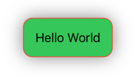
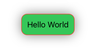
3. Adding a border
In the third and final part, we will add a border to a rounded-corner rectangle. We will use the overlay API which will overlay our rounded-corner view with rectangles with the same styles and border with input border width and color.
struct RoundedCornerWithShadow: View {
    var body: some View {
        Text("Hello World")
            .padding()
            .background(
                RoundedRectangle(cornerRadius: 12)
                    .fill(Color.green)
                    .shadow(color: Color.black.opacity(0.5), radius: 12, x: 0, y: 0)
            )
            .overlay(
                RoundedRectangle(cornerRadius: 12)
                    .stroke(Color.red, lineWidth: 1)
            )
    }
}
Creating a View Modifier
The above code works like a charm, but it's not reusable. If we want to apply these styles to many more views, we need to copy-paste all the styles and change the parameters.
Let's make this code reusable by wrapping it in the view modifier. That way it stays in just one place and we don't need to apply updates in multiple places. We can simply pass the style parameters in the view modifier initializer and the modifier takes care of applying desired styles.
// An utility view extension
extension View {
    @ViewBuilder
    func `if`<Transform: View>(_ condition: Bool, transform: (Self) -> Transform) -> some View {
        if condition { transform(self) }
        else { self }
    }
}

// View modifier implementation
struct RoundedCornerWithShadowModifier: ViewModifier {

    let contentPadding: CGFloat
    let cornerRadius: CGFloat
    let isShadow: Bool
    let borderColor: Color
    let borderWidth: CGFloat

    init(contentPadding: CGFloat = 12.0, cornerRadius: CGFloat, isShadow: Bool = false, borderColor: Color, borderWidth: CGFloat) {
        self.contentPadding = contentPadding
        self.cornerRadius = cornerRadius
        self.isShadow = isShadow
        self.borderColor = borderColor
        self.borderWidth = borderWidth
    }

    func body(content: Content) -> some View {
        content
            .padding(contentPadding)
            .background(
                RoundedRectangle(cornerRadius: cornerRadius)
                    .fill(Color.green)
                    .if(isShadow) { $0.shadow(color: Color.black.opacity(0.5), radius: 12, x: 0, y: 0)
                    }
            )
            .overlay(
                RoundedRectangle(cornerRadius: cornerRadius)
                    .stroke(Color.red, lineWidth: borderWidth)
            )
    }
}

// Rounded corner with shadow demo code
struct RoundedCornerWithShadow: View {
    var body: some View {
        Text("Hello World")
            .modifier(RoundedCornerWithShadowModifier(cornerRadius: 12.0, isShadow: true, borderColor: .red, borderWidth: 1.0))
    }
}
In the above example, the view modifier is providing default values for content padding and shadow availability. The client needs to pass the rest of the parameters while applying the view modifier to the input view.
Using the above view modifier, we can apply these styles to any view with just one line of code.
As you can see here, even though we changed the way we applied these styles to the view, the implementation logic still remained the same and there is no outward change in the modified view.
Summary
So this was all about styling SwiftUI view with the most frequently used styles in the iOS app. Are there any other styles you want to apply but don't know how? Do you want to suggest any modifications to the code above? What other SwiftUI features would you like to know in depth? Let me know your thoughts by reaching out on LinkedIn.
Source Code
The full source code for this tutorial is available on GitHub Gist for further reference
Support and Feedback
If you have any comments or questions, please feel free to reach out to me on LinkedIn.
If you like my blog content and wish to keep me going, please consider donating on Buy Me a Coffee or Patreon. Help, in any form or amount, is highly appreciated and it's a big motivation to keep me writing more articles like this.
Consulting Services
I also provide a few consulting services on Topmate.io, and you can reach out to me there too. These services include,