Making user friendly mobile apps

We all love using apps, don't we? They are great utility and ubiquitous after the propagation of smartphones all around us. However, as I do and I am sure lots of other people would be experiencing glitches that could lead to bad user experience.
In this post, I will list some of my less than ideal experiences, briefly explaining why I regard them so, and ways to alleviate the underlying problem. Some of these theories might be subjective - meaning not all the people will find them disruptive and intrusive. Not all the people may agree with this assessment, but I still want to enlist them just in case one of the developers stumble upon them, or for someone who is getting into app development, design, and user experience and want to have a list as a reference while designing and targetting professional level apps.
It is important to note that I am an iOS user and developer. Most of the issues that I mention in this post are (mostly) thought with respect to this platform. It's not totally out of question to aim towards applying similar philosophies to mobile applications on other platforms as well
1. Avoiding clutter and distraction
It's understandable for businesses to pack as many features as possible into the application. But not to the point where users might find them intrusive, distracting, and complicated. It takes a good user experience personnel to spot these things and go against a will of an over-ambitious product manager to simplify the situation.
Here, I want to talk in terms of some apps along with associated screenshots. I have been a long fan of Twitter. I installed it 4 years ago on my iPhone 5s and everything was going well before they decided to add this new feature with the sticky button to create a new tweet in the bottom right corner of the page.
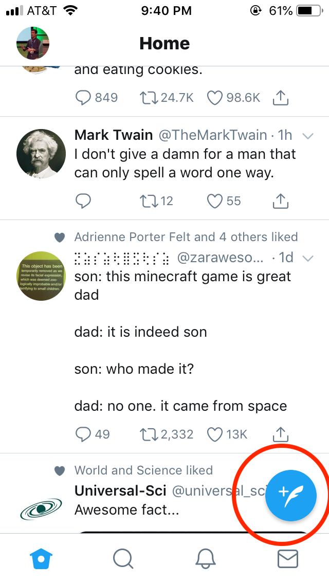
- It partially hides the Tweet content. There is no extra spacing or margin provided to avoid the overlapping of elements
- It's a distraction and takes relatively large space, especially on the smaller devices
- It's possible to accidentally press this button while browsing the newsfeed
As a user who was comfortable with the existing design, I would expect Twitter to allow me to easily select which option I would like to go with. I am pretty sure they've done A/B testing on it before, but it doesn't mean it's ideal and loved by all the users.
Let's look at the other example. Again from Twitter.
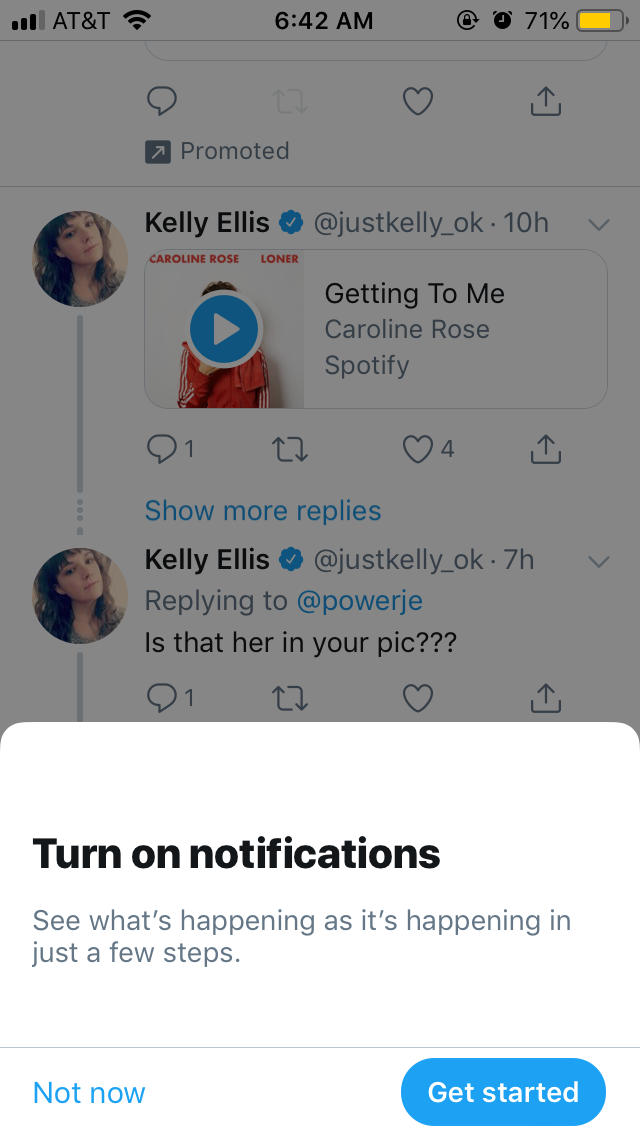
Today while browsing through the timeline they showed me this pop-up. Obviously, I wasn't interested in notifications and I tried to swipe down to dismiss, but no avail. Top? Left? Right? Nothing. Looks like they wanted me to specifically tap on "Not Now" button.
But why so? Swipe to dismiss to dismiss the modal is a standard practice. If they want to have tracking (Which I am sure they do) when someone picks not to have notifications enabled, they can still track it when swipe to dismiss is executed. But having to see this pop-up helplessly with only one and cumbersome way to dismiss is not a pleasant experience.
Let's take a look at another app. This is a matrimonial app called Anuroop.
This seems to me like another app which completely disregards people on smaller iPhone devices by the way
I have censored some parts of the screenshot for privacy reasons
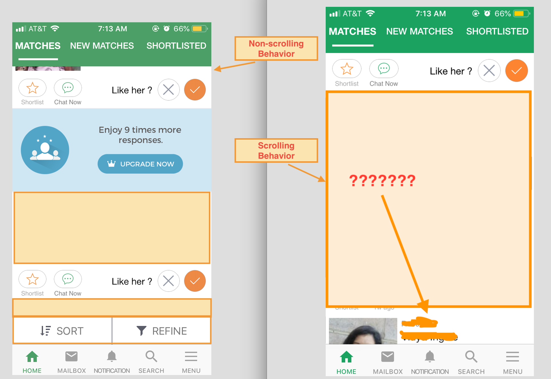
There are two screenshots for the comparison. The one on the left is how it looks when the view is at the rest, and the one on the right is when the user scrolls the page. The buttons to sort and refine list items are not visible until the scrolling has completely stopped.
- This continuous toggle of controls is confusing. Rather, why not show these elements all the time?
- How does it affect the behavior in case they are shown all the time?
- As a user, I will be concentrating on the content of the list and not on some random element which hides/shows at certain intervals?
- Even if we give the benefit of doubt to these designers for such a bad UX, appearance and disappearance of elements is not smooth and they immediately snap in place
- Why do they have to be so big for both icon and text? Users with any level of experience with the app should be able to tell what these buttons do just by looking icons
2. Providing accessible and usable features
For one moment let's assume product managers want to throw as many features possible at users. That is fine. But what about when users find it difficult to use them and those features become a constant source of frustration?
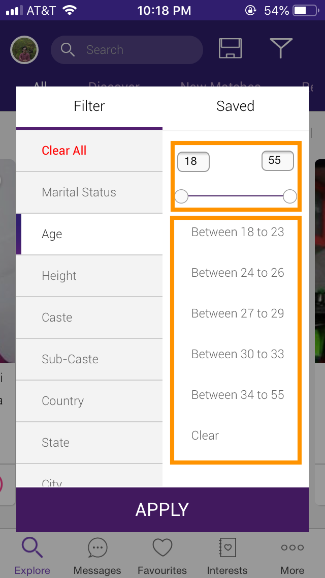
First off, do you see the list of age ranges there? I don't know who and how it was made. But it makes no sense. People are not always going to abide by that and what if they want to search profiles with overlapping ranges? (As it happened in my case). Right now, just by looking at these ranges there is no way to choose profiles with age range 20-25 or 28-32 or 32-38.
Let's move on to another weird element on this screen, and unfortunately, it's still there. It's the age slider and how awkward it is while users are trying to slide it along,
-
First off, it's not the standard iOS design. The slider may resemble more to Android or web. But on iOS it's standard to use the picker for picking numbers or ranges. This is the example of a perfect use-case where picker would act much better
-
There is not much space between the chosen value and the slider. There is a strong possibility that users won't even see the chosen range until they take their finger off the slider. This can be solved by adding extra padding around both number fields and slider
-
Slider width is so small (Even more pronounced on smaller devices). Which means even the slightest movement can change numbers by higher magnitude. This problem too can be solved by utilizing native picker control
-
Let's say slide is essential in this case for some business reason. Fine! Let's keep it that way. But can we, first - Add the native slider (Doesn't make a lot of difference though. Overall this app hardly looks like a native iOS application). Second - Can we make this slider almost match the width with padding on both sides? That way we can have less fluctuation as users slide it to choose age-ranges.
3. Saving preferences between app install/uninstall
If I have to choose the most complicated piece of the system in any modern mobile application from the user perspective, it has to be preferences or settings. Sometimes it may take forever to find the specific piece or remember it afterward. I like apps which not only persistently save these preferences between successive launches, but also between app install/uninstalls.
For example, earlier on the Twitter app, I customized a couple of options.
- Dark mode
- Turning off autoplay for videos in the Newsfeed
So far so good. A few months later I uninstalled the app and reinstalled it back. When I open it and go to the Newsfeed,
- The screen is filled with bright white light
- Videos keep auto-playing
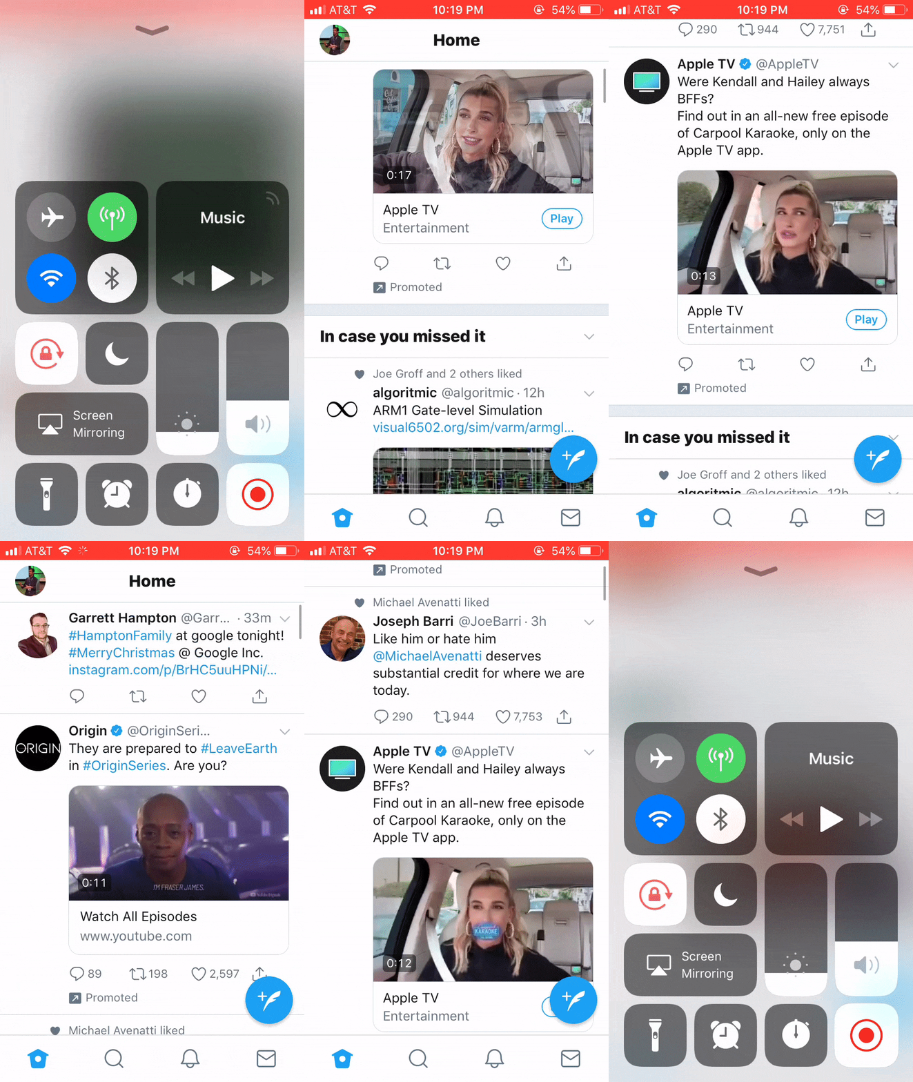
I understand that certain preferences might be built only for that instance of the installed app on the specific device. However, I am pretty sure users still want to maintain those between installing/uninstalling cycles and multiple devices.
These problems can be solved by maintaining these preferences on the server instead of local storage which won't be transferable for apps installed across the array of devices for the same account.
A similar thing might happen for search criteria when applied to find profiles.
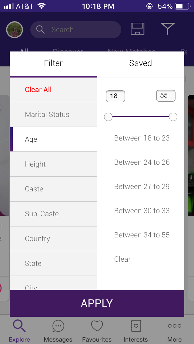
As a user, my search criteria might be stringent and can take several minutes depending on my familiarity with the application. However,
- There is no way to save the selected filter parameters
- It is ironic given that we already have
Savedtab on the right. How does it save the filter list? Is it by default, or from the web? - Ideally, I would like the app to default to the filter criterion that I used last time irrespective whether I use the service on the web or mobile application. This can easily be handled by saving those criteria on the server-side instead of locally
4. Handling permission dialogues
This is a serious and sensitive matter when it comes to privacy and requesting permissions. It's always a battle between apps asking to convince users to use the app as much as possible versus users who do not want apps to meddle in their life too much. Here are some of the guidelines from my own experience,
-
Ask permissions only when they're needed. What does it mean? Do not ask for location permissions until they want to search for something close to their current location or they're doing live tracking of packages being delivered to their doorstep
-
Same goes for push notifications. I know how much they mean for marketing people, but as a user, it's my biggest turn-off moment to see them the instance app is successfully installed. You should give users some time to play with the app and then let them decide which way do they want to go with. Additionally, you can also initiate these requests when the customer places an order of item through the app and now push notifications can enable them to track the package or stay up-to-date with the latest offers
-
No matter when and how you ask permissions, you should give your users convincing reason on how enabling these permissions can improve their app experience and allow them to take advantage of relevant features and promotions
5. Testing for missing localizations
Probably not applicable to all the apps, but still relevant. Nowadays with companies expanding their reach across geographical borders, it's not unusual to find apps which are supported in at least two languages.
The problem with most of these so-called multilingual apps is either their translation is missing or they're translated incorrectly. As a native speaker of that language, when I see app making such mistakes, it's heartbreaking.
Here are some of the mistakes and remedies from my own experience that can be useful,
-
Always decide what are the things you want to translate. It's ok to keep certain keywords related to promotion or brand same in all locales. It should be fine as long it is consistent for all of them so as not to cause confusion for users who are comfortable using the app in more than just one language
-
It's not recommended to use Google translate for professional level translations. Translation is a hard problem and it's always preferred to treat with extra caution and care. If you can employ professionally qualified translators, it's good. But if not, you can use online services. I know of one such service Smartling which boasts of employing human translators. I have used it for quite a while and had a nice experience with it
-
In spite of taking all sorts of care, it's still possible to find missing translations. To detect this, developers can add debug feature accessible to internal users and testers which will flag the words with missing translations (Color them distinctively on the UI) along with the relevant locales. This is helpful for translation audit and compile the list of strings with missing translations and corresponding locales.
6. Deploying light and simple search bar
This again is related to the feature creep attitude. It's common to see as many features as possible crammed in one place where the user is at the point of giving up. One such example is a search bar and the unending list of buttons attached to it.
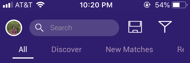
Let's do some analysis on the design of the search bar
-
The search bar itself is too small, which means there is no tappable area and the user probably have to tap around that area a few times before activating it
-
The problem mentioned in the previous point can be partially fixed by increasing the search bar height. But even better, by expanding it to the right side by reducing the space occupied by two extra buttons
-
Usually, it's ok to add one button along with search bar. But two buttons is just too much. If you want more than one, and they're so much important you can add them somewhere on the same page. This will give you the flexibility to add some more if needed in near future
-
The search bar just says "Search" here. Which is confusing. As a first time user, I want to know what am I searching for. It will be good if they could add brief details on exactly what the user can search through this bar
-
Last thing - Not quite related to the search bar, but more about design details. If you look at individual elements going from left to right, their spacing is inconsistent. At some point, it seems 10 pixels while other elements look like 20 pixels apart. As a designer and QA, it's important to recognize and eliminate such inconsistencies before delivering an app to the end user
7. Consistently jumping back and forth between the app and mobile web
Let's be honest about it. When it comes to deploying new features, browser and mobile web always get a priority. However, when it comes to deploying them on mobile apps, it's either weeks of development, fight with backend devs, a simple and proven strategy - Use a WebView. The last option, however ugly it might be can save the day and ultimately secure a revenue among app savvy user-base.
However, this advantage often comes with a problem for both developers and users. After all, WebView is meant to use as a temporary workaround until the native app is ready with the feature, and as with all workarounds, nobody bothers to worry about it too much.
-
For customers it could be a confusing experience to go from app to mobile web. Agreed, they may look similar but nevertheless, it's a different experience and they may feel like a disruption in their experience
-
Mobile web is not always guaranteed to behave in the same way it does on browsers. This can result in a broken user experience. One such example is web view on iOS was unable to display certain
iframeelements which were clearly visible on regular browsers -
When it comes to session management, cookies are highly useful. However, due to limitations on iOS platform they cannot be set with
SFSafariViewControllerso developers are forced to useUIWebViewto handle that part -
When the user is redirected to the mobile web and executes the series of activities, the app is not cognizant of it. When transaction succeeds - such as the purchase or a product or app membership and the user is redirected to the app, they can still see the old state which could be confusing.
-
Solution to the problem mentioned in the previous bullet could just be refreshing the whole app as the transition is made from mobile web back to the app. But this is an inefficient solution, given that users may or may not have executed those transactions which require the app to force refresh and can result in a performance penalty
I totally get and agree with the strategy of maintaining feature in the app through web view until native development is done. But it's always important to keep in mind that this is not the best solution and treated as such. That being said, emphasis should be given to treat such transition with high priority and work with backend engineers whenever necessary to address this problem permanently.
8. Support to submit user feedback through the app
How many times were you frustrated or pleasantly delighted with that app and want to let owners tell about it but couldn't do it without going through app store reviews? It's frustrating, I know.
It's cumbersome and obscure to let users leave their reviews through the app store and then come back to respond to it one by one.
-
Developers don't know which version customers were using
-
They are not aware of metadata for the app version under review
-
Authenticity of review content cannot be verified. There are often so many trolls in the app store review section
Most of these problems can be addressed by incorporating in-app user feedback system which lets user divide their feedback into one or more categories. They can explain it with a brief title and broad description which then can be communicated to developers through customer care representatives.
Of course, just sending these details is not enough. As an extension, you might also want to include app metadata which includes, but not limited to build and version number, geo, environment etc. Some time back I wrote the blog post about Getting iOS app metadata to get and send the basic information along with the user feedback or in case of app crash.
9. Low bandwidth support for LTE networks
Although the internet is pervasive all around us, we still have to deal with data restrictions that mobile companies put on us. This puts a lot of restrictions on how apps are developed and used. Indeed, LTE data is expensive you don't want to press it too much. This can totally be improved from the developer's point of view.
-
Apple provides an API to detect kind of network connection, one of which is a Wi-fi type. The app can change the behavior if the slower connection is detected
-
When on the network other than Wifi, things can be improved for the user by
- Not doing background fetch
- Refreshing foreground data less frequently
- Downloading low-resolution images
- Enabling caching or increasing cache size
- toggling off features with higher data requirements
Of course, not all the users want to have sub-optimal experience when on LTE networks. Like in my case, my mobile provider allocates me 5GB of monthly data so I hardly give a thought whether I am on LTE of Wi-fi. If this is the case, you might also want to present users with an in-app option to choose app behavior when they're on Wi-fi vs. on the mobile network
10. Detecting low power mode and changing the app behavior
Detecting and changing behavior to accommodate low power mode is very similar to dealing with a slower network connection, just in a different context.
Developers can detect when low power mode is activated through iOS settings. This support was added starting from the iOS 9. The API is simple to use and it's recommended to put this code in a centralized location so that other parts of the application can also take advantage of it. Apple has Energy efficiency guidelines which can be used as a foundation reference.
When in the Low Power Mode,
-
Avoid playing videos or music by default
-
Try batching, scheduling, or prioritizing battery-draining tasks
-
Network operations are one of the major sources of excessive power consumption. The cache can be utilized instead of executing network requests in this case
-
Avoid accessing locations - Location access consumes a significant amount of energy. Unless user location is already cached, fetch the location for the first time, cache it and use the previously cached value every time location access is requested while the device is set to use a low-power mode
-
Toggle off the ARKit - ARKit is another example of an application which needs a lot of battery power to operate effectively. This is due to camera usage plus those high-level computations to detect plane and place objects in the vicinity.
As mentioned in the previous point, you don't always have to alter behavior like this when in the low-power. When in doubt, always provide users to choose one option over the other. This can be done by showing alert dialogue for the first time and then also providing in the app preferences.
11. Being verbose is always better than no words
How many times have you experienced getting stuck somewhere in the app or not able to change the option? Wouldn't it be better if developers might have provided little more information on how to get you out of the quagmire? When in doubt, always provide little extra information.
Let me share my experience from this morning. I enabled a low-power mode yesterday and totally forgot about it.
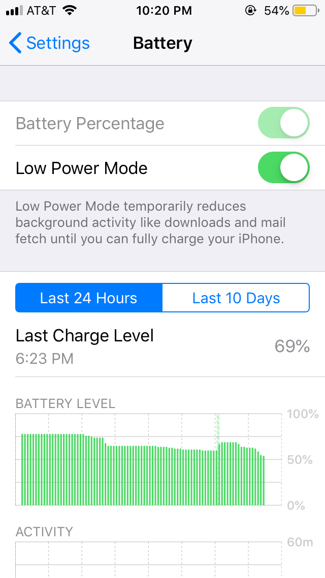
When I woke up and started using the phone again, I realized that the screen was getting dimmed every 30 seconds. Obviously, I went to Display and Brightness under Settings and found out that Auto-lock was grayed out. Frustrated, I tried two more times until I found out the real issue after reading the text below it.
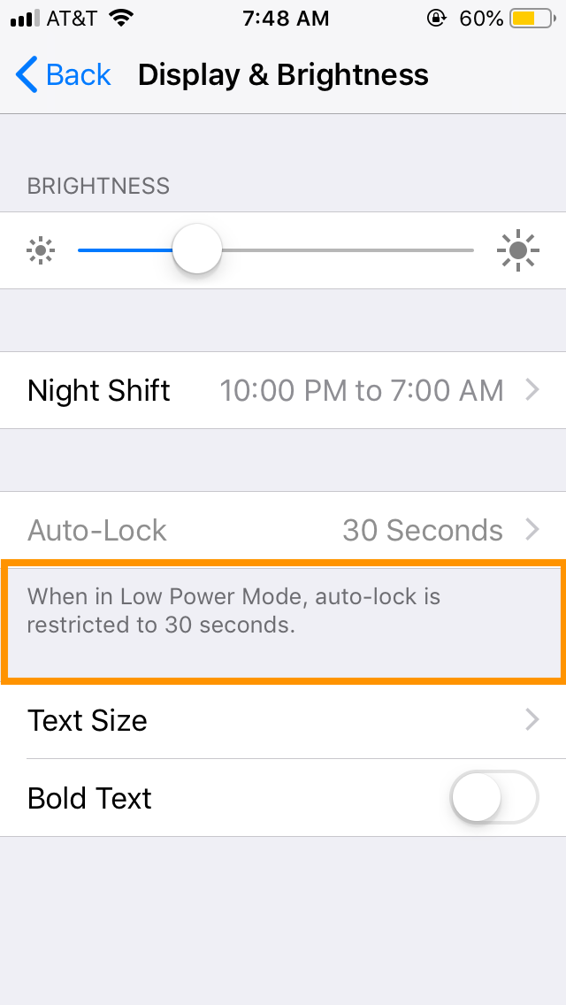
As a user who might have turned on the series of random features a long time ago, there was no way for me to know that this was caused by specifically turning on the Low power Mode.
The same philosophy goes for user experience consideration in the app.
-
It's ok to provide user preferences section with varying options. But also divide it in sub-section for easier navigation and offer search bar to instantly jump to any option
-
Don't overwhelm users with too much information at once. Based on tracking and analytics, group the list of top preferences frequently used by most people and place them on the top
-
When the certain feature is disabled or grayed out, provide a brief description below it explaining what might be the possible reason
-
If point 4 is not possible due to space limitation, it's ok to let user tap on the option, but instead of triggering feature you can either take the user directly to help section to automatically search within current context or display a brief message in the form of an alert box or a modal pop-up
12. Loading state and feedback mechanism
-
As Newton once said, "Every action has an equal and opposite reaction" - Not quite true all the time, but every button tap should trigger some action clearly visible to the user. It's quite annoying to see button being pressed and nothing happens on the screen.
As a good developer and UX designer, it's always important to take these circumstances into consideration. No matter what the action is, or outcome would be, it's important to give the intermediate and final feedback to the user. Let's look at some examples.
Suppose we have the app which displays the list of names. We also have a preferences section on another page which allows clearing the list, but without any feedback - whether the list has been cleared or not.
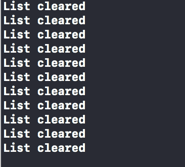
As it's clear from above gif and the console log, the user has been repeatedly tapping Clear list button because they don't know if it actually cleared a list or not. If it's an expensive operation, in addition to the confusion it can waste valuable CPU and energy resources.
How about if we add a feedback when the list is indeed cleared? If they attempt to clear the list again, we can show the warning message.
This is certainly better than the previous approach because,
-
There is a clear feedback after action
-
Feedback allows users to assess whether the action was a success or failure
-
It serves to prevent users from executing the same action again and again which will give the same result
-
In case action triggers an expensive operation or network request, this kind of feedback can also prevent such accidental trigger
- Let's take a look at another example to display a loading state before data is downloaded and displayed to the user. Often is the case with the heavy operation of network data, the action may not trigger instant result and we want to provide users with loading state to let them know the action is in progress. If not, they might get confused and leave the screen.
-
As excited as I am to view this fall image, I won't be totally happy if nothing happens. No loading indicator, no success or failure message - Totally no activity. So I just backed off and went back to the home screen oblivious of the fact that image was still loading as I tried to go back.
Let's try to make this better by providing the loading message, indicator along with nice to have information which displays the percentage of the image downloaded so far. If something fails, we should also provide a button to let users try again. Let's see all this in action
This is again better than earlier user experience. Now we have,
- Loading indicator
- Message with loading text along with the progress made in terms of percentage
- A way to fire request one more time if the previous one fails for some reason
-
Let's take a look at last use-case of properly utilizing loading and disabled state for time-consuming operation while the user is waiting to get the result back.
This is a simple screen. Which allows users to tap the button, triggers a network request and when successful, takes the user to the next page.
However, it has a serious flaw. While user taps the button and network request is in the flight, the user can potentially tap it multiple times. This can lead to the user being redirected to the same page as many times as the number of taps.
It has a simple solution. In addition to providing loading indicator, we can also disable to button which triggers the transition to the next page. When the request finishes, (Irrespective of whether it succeeded or failed) we will enable it. This will present users from tapping it multiple times.
13. When in the production environment, act as if you must use the production data
I didn't plan to write about it in the original write-up, but I saw something this morning in the Anuroop app I was using.
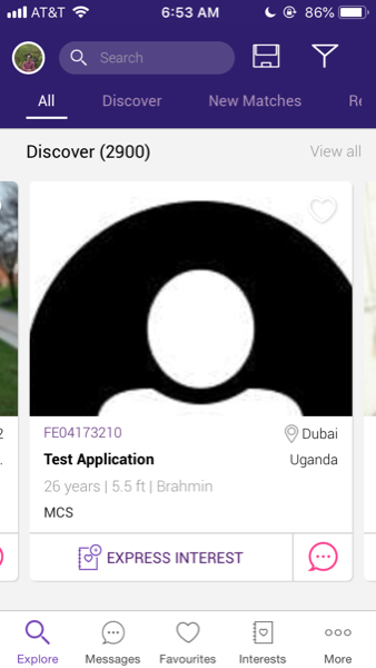
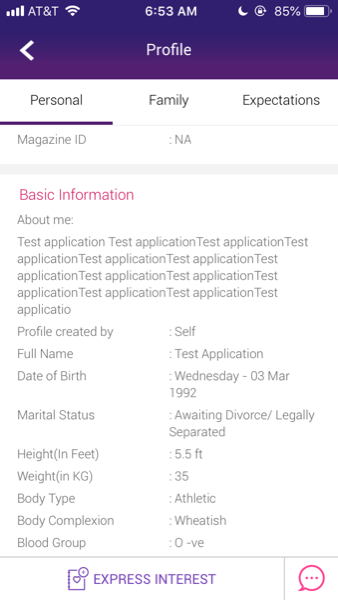
This is not exceptional which occurred only in this app. I have seen instances of such behavior from even prominent and leading apps. These apps can frequently send test pushes, messages or even redirect to dummy home page with garbled data full of lorem ipsum dolor sit amet text.
As a software engineer, I can totally get it and understand why such cases might happen. But as a regular user, this is confusing and distracting to have to look at test data. This raises serious questions such as what if all the data I am looking at is a test data, how do I differentiate between real and test account? How does it affect my experience with other platforms such as browser and Android?
There are certain steps the team can take to avoid the possibility of such things happening,
-
Maintain separate servers for hosting test and production data. That way test data will appear only when the test server is selected
-
Incorporate the rigorous automated and manual QA process to catch such accounts during the testing phase
-
Worst case scenario, you must include a test account in the production database - Fine! But please make sure to tag them as such. Call it something similar to test accounts and add a brief description to disregard it from user's perspective
If you have test accounts which look like real accounts, you've done a great job as long as you're on the test server. But as those accounts get carried to the production environment, there is not an easy way for average users to distinguish them from the accounts they might be genuinely interested in


