TableView via CollectionView on iOS - Lists in UICollectionView

🛑 Read Before Proceeding
Please make sure that you are using Xcode 12 (Beta or stable release) and above supporting iOS 14 and later versions. Most of the APIs mentioned in this post were announced during WWDC-2020 and shipped with iOS 14. If you don't have Xcode 12 or later, you can download it from this StackOverflow link
Today I am going to write about new UICollectionView feature introduced in iOS 14. It's called Lists in UICollectionView. Here, we will go through step-by-step instructions to see how we can build Lists a.k.a UITableView simply by using iOS 14 UICollectionView APIs.
Here's the list of things we're going to learn today,
- Building a simple list
- Adding Header and Footers to this list view
- Alternative way of adding Header and Footer views with the same result as #2
- Adding Swipe actions to List view cells
- Adding Accessories to List view cells
If you directly want to play with the code before going through the blog post, you can download the source from GitHub repository. Please make sure to switch to branch collection-view-lists-demo as I have other branches in the same repository to demo related projectsBuilding a simple list
To build a simple list, we will use new Snapshot and DataSource APIs introduced in iOS 13. First off, let's declare UICollectionView instance and data source associated with it on the top of file,
    @IBOutlet weak var collectionView: UICollectionView!
    var dataSource: UICollectionViewDiffableDataSource<Section, Int>!
Here, we need to pass the Section data and our view model. Since this is a simplistic example, instead of passing any complex view model, we are passing integers as input data.
In real life your collection view can have multiple sections. For the sake of this example, we are going to use only one section named rows.
    enum Section: Int, CaseIterable {
        case rows
    }
Collection views need cells to display their data in scrollable format. To do that, first we will create new cell subclass. Generally you will subclass UICollectionViewCell for such cells, but here we're going to subclass UICollectionViewListCell which was introduced in iOS 14 to create cells.
Let's call this class MyCellCollectionViewListCell
    class MyCellCollectionViewListCell: UICollectionViewListCell {

        let label = UILabel()

        static let reuseIdentifier = "list-cell"

        enum Constants {
            static let padding: CGFloat = 10.0
        }

        override init(frame: CGRect) {
            super.init(frame: frame)
            self.setupViews()
        }

        private func setupViews() {
            backgroundColor = .blue
            label.numberOfLines = 0
            label.adjustsFontForContentSizeCategory = true
            label.translatesAutoresizingMaskIntoConstraints = false
            addSubview(label)

            let imageView = UIImageView(frame: .zero)
            imageView.image = UIImage(named: "person")
            imageView.translatesAutoresizingMaskIntoConstraints = false
            addSubview(imageView)

            NSLayoutConstraint.activate([
                imageView.leadingAnchor.constraint(equalTo: contentView.leadingAnchor, constant: Constants.padding),
                label.leadingAnchor.constraint(equalTo: imageView.trailingAnchor, constant: Constants.padding),
                label.trailingAnchor.constraint(equalTo: contentView.trailingAnchor, constant: -Constants.padding),
                label.topAnchor.constraint(equalTo: contentView.topAnchor, constant: Constants.padding),
                imageView.topAnchor.constraint(equalTo: contentView.topAnchor, constant: Constants.padding),
                imageView.heightAnchor.constraint(equalToConstant: 30),
                imageView.widthAnchor.constraint(equalToConstant: 30),
                label.bottomAnchor.constraint(equalTo: contentView.bottomAnchor, constant: -Constants.padding),
                separatorLayoutGuide.leadingAnchor.constraint(equalTo: label.leadingAnchor)
                ])
        }

        required init?(coder: NSCoder) {
            fatalError("init(coder:) has not been implemented")
        }

    }
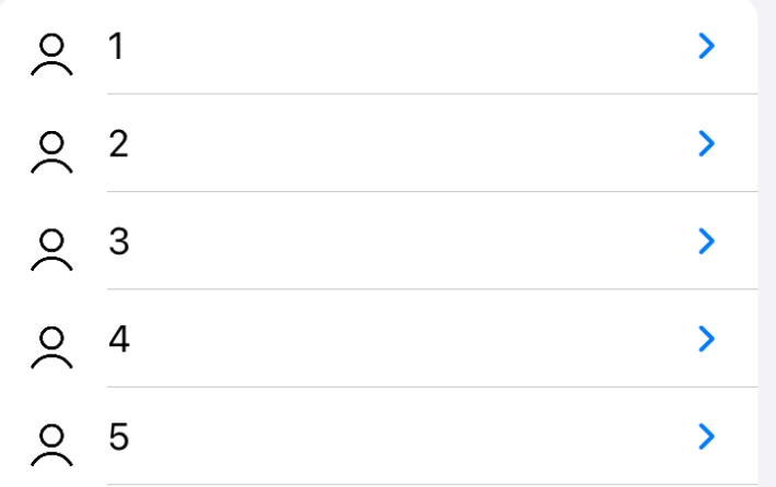
It's a simple cell with just an image and a label horizontally arranged next to each other. Here's how it will look like when you run the app,

Important
Please note how cell separator is aligned with label's leading edge. This works because of thus constraint in above code example,
separatorLayoutGuide.leadingAnchor.constraint(equalTo: label.leadingAnchor)
This feature was introduced in iOS 14 and allows developers to align cell separator view with any cell subview. For example, if you want this separator to align with the leading edge of image, you would replace above constraint with following code,
separatorLayoutGuide.leadingAnchor.constraint(equalTo: imageView.leadingAnchor)

Apple added the confusion to how this API should be used. If you watch the official video, around time 11:00, they have added a code as if we can directly manipulate theleadingAnchorofseparatorLayoutGuide. Unfortunately, Xcode won't allow you to directly change it like this so you have to constrainseparatorLayoutGuideas shown in example above
Since our cell is ready, let's register it to the collection view with cell class and reuse identifier declared inside the cell,
collectionView.register(MyCellCollectionViewListCell.self, forCellWithReuseIdentifier: MyCellCollectionViewListCell.reuseIdentifier)
Next, let's setup our dataSource. This data source will enable us to accept parameters such as collectionView, indexPath and input data through the closure and we will use this data to return the UICollectionViewCell instance. We will call it a dataSource initializer.
        dataSource = UICollectionViewDiffableDataSource
            <Section, Int>(collectionView: collectionView) {
                (collectionView: UICollectionView, indexPath: IndexPath,
                number: Int) -> UICollectionViewCell? in

                guard let cell = collectionView.dequeueReusableCell(
                        withReuseIdentifier: MyCellCollectionViewListCell.reuseIdentifier, for: indexPath) as? MyCellCollectionViewListCell else {
                    fatalError("Cannot create new cell") }
                cell.label.text = "\(number)"
                return cell
        }
But this dataSource closure is useless without us filling in dataSource with some raw data. Let's do that before asking collection view to reload itself
    func loadData() {

        var sequenceRowData: [Int] = []

        for i in 1...20 {
            sequenceRowData.append(i)
        }

        var snapshot = NSDiffableDataSourceSnapshot<Section, Int>()
        snapshot.appendSections([.rows])
        snapshot.appendItems(sequenceRowData, toSection: .rows)
        dataSource.apply(snapshot, animatingDifferences: true)
    }

    override func viewDidLoad() {
        super.viewDidLoad()
        loadData()
        ...
        ..
    }
Next, we want to define and assign the tableView cell type layout to collection view. This can be achieved by assigning custom collection view layout,
    private func createLayout() -> UICollectionViewLayout {
        let layout = UICollectionViewCompositionalLayout { (sectionIndex: Int, layoutEnvironment: NSCollectionLayoutEnvironment) -> NSCollectionLayoutSection? in

            var configuration = UICollectionLayoutListConfiguration(appearance: .insetGrouped)

            let section = NSCollectionLayoutSection.list(using: configuration, layoutEnvironment: layoutEnvironment)

            return section
        }
        return layout
    }

    override func viewDidLoad() {
        super.viewDidLoad()
        collectionView.collectionViewLayout = createLayout()
        ...
        ..
    }
Here we are creating a custom configuration which is of type UICollectionLayoutListConfiguration which tells collectionView to arrange its cells in table view cells format. We use this configuration to create a section of type NSCollectionLayoutSection responsible for final layout and return it from the closure.
And this is all we needed to do to display simple list in UICollectionView. If you run the app now, you will see the layout like this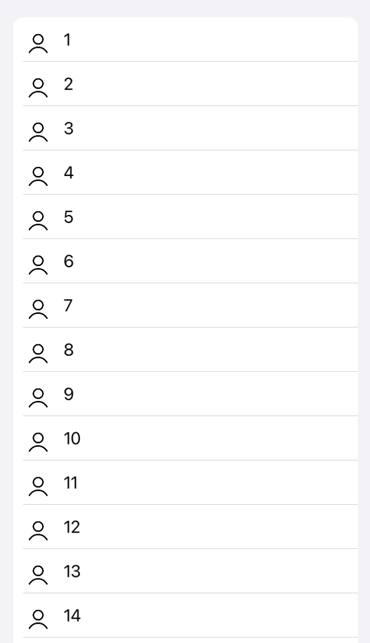
Adding Header and Footers to this list view
In order to add header and footer views to collection view sections, we can use couple of properties on UICollectionLayoutListConfiguration which are set while creating a layout.
    private func createLayout() -> UICollectionViewLayout {
        let layout = UICollectionViewCompositionalLayout { (sectionIndex: Int, layoutEnvironment: NSCollectionLayoutEnvironment) -> NSCollectionLayoutSection? in

            var configuration = UICollectionLayoutListConfiguration(appearance: .insetGrouped)

            // Set these properties to add header and footers to collection view
            configuration.headerMode = .supplementary
            configuration.footerMode = .supplementary

            let section = NSCollectionLayoutSection.list(using: configuration, layoutEnvironment: layoutEnvironment)

            return section
        }
        return layout
    }
We will also create dedicated header and footer view classes both inheriting from UICollectionReusableView
ListSupplementaryHeaderView.swift
class ListSupplementaryHeaderView: UICollectionReusableView {

    static let reuseIdentifier = "list-supplementary-header-reusable-view"
    let label = UILabel()

    enum Constants {
        static let padding: CGFloat = 10.0
    }

    override init(frame: CGRect) {
        super.init(frame: frame)
        backgroundColor = .black
        label.numberOfLines = 0
        label.adjustsFontForContentSizeCategory = true
        label.translatesAutoresizingMaskIntoConstraints = false
        label.backgroundColor = .orange
        addSubview(label)

        clipsToBounds = true
        layer.cornerRadius = 10.0

        NSLayoutConstraint.activate([
            label.leadingAnchor.constraint(equalTo: leadingAnchor, constant: Constants.padding),
            label.trailingAnchor.constraint(equalTo: trailingAnchor, constant: -Constants.padding),
            label.topAnchor.constraint(equalTo: topAnchor, constant: Constants.padding),
            label.bottomAnchor.constraint(equalTo: bottomAnchor, constant: -Constants.padding),
            ])
    }

    required init?(coder: NSCoder) {
        fatalError("init(coder:) has not been implemented")
    }
}
ListSupplementaryFooterView.swift
class ListSupplementaryFooterView: UICollectionReusableView {

    static let reuseIdentifier = "list-supplementary-footer-reusable-view"

    let label = UILabel()

    enum Constants {
        static let padding: CGFloat = 10.0
    }

    override init(frame: CGRect) {
        super.init(frame: frame)
        backgroundColor = .black
        label.backgroundColor = .gray
        label.numberOfLines = 0
        addSubview(label)
        label.translatesAutoresizingMaskIntoConstraints = false

        clipsToBounds = true
        layer.cornerRadius = 10.0

        NSLayoutConstraint.activate([
            label.leadingAnchor.constraint(equalTo: leadingAnchor, constant: Constants.padding),
            label.trailingAnchor.constraint(equalTo: trailingAnchor, constant: -Constants.padding),
            label.topAnchor.constraint(equalTo: topAnchor, constant: Constants.padding),
            label.bottomAnchor.constraint(equalTo: bottomAnchor, constant: -Constants.padding),
            ])
    }

    required init?(coder: NSCoder) {
        fatalError("init(coder:) has not been implemented")
    }
}
Both header and footer specify their own reuseIdentifier inside the class. Using this unique identifier and supplementary view kind information, let's register these supplementary views to the collection view.
    enum Constants {
        static let listHeaderElementKind = "list-header-element-kind"
        static let listFooterElementKind = "list-footer-element-kind"
    }

    // For List view cells header and footers
    collectionView.register(ListSupplementaryHeaderView.self, forSupplementaryViewOfKind: Constants.listHeaderElementKind, withReuseIdentifier: ListSupplementaryHeaderView.reuseIdentifier)

    collectionView.register(ListSupplementaryFooterView.self, forSupplementaryViewOfKind: Constants.listFooterElementKind, withReuseIdentifier: ListSupplementaryFooterView.reuseIdentifier)
Finally, we will set up supplementaryViewProvider on the collection view dataSource. This will enable us to return the appropriate supplementary view given the input kind and indexPath. You can't always return one type of header or footer as collection view may contain multiple sections and each of these sections may need its own custom header and footer view.
        dataSource.supplementaryViewProvider = { (collectionView: UICollectionView, kind: String, indexPath: IndexPath) -> UICollectionReusableView? in


            if kind == UICollectionView.elementKindSectionHeader {
                if let headerView = collectionView.dequeueReusableSupplementaryView(ofKind: Constants.listHeaderElementKind, withReuseIdentifier: ListSupplementaryHeaderView.reuseIdentifier, for: indexPath) as? ListSupplementaryHeaderView {
                    headerView.label.text = "List Header\nHeader\nHeader\nHeader"
                    return headerView
                }
            }

            if kind == UICollectionView.elementKindSectionFooter {
                if let footerView = collectionView.dequeueReusableSupplementaryView(ofKind: Constants.listFooterElementKind, withReuseIdentifier: ListSupplementaryFooterView.reuseIdentifier, for: indexPath) as? ListSupplementaryFooterView {
                    footerView.label.text = "List Footer\nFooter\nFooter\nFooter"
                    return footerView
                }
            }

            return nil
        }
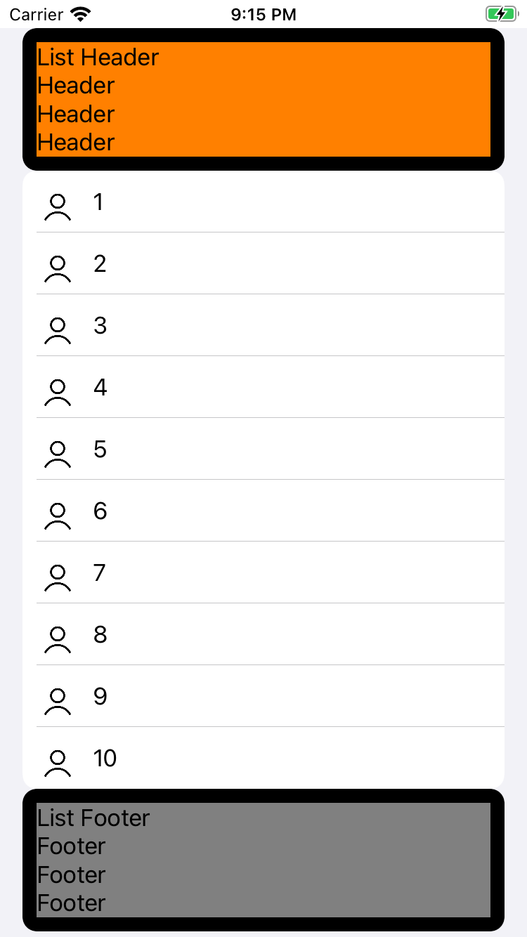
If you run the app now, you will see all the cells along with header and footer as follows,
Alternate way of adding Header and Footer views with the same result as #2
There is however one more way of adding header and footer views to collection view sections.
While creating a custom row layout, instead of using headerMode and footerMode, we will create header and footers by subclassing NSCollectionLayoutBoundarySupplementaryItem. NSCollectionLayoutBoundarySupplementaryItem takes 3 parameters - the size, element kind string, and how supplementary view should be aligned.
Once header and footers are created, we can associate them with boundarySupplementaryItems property of section object,
    private func createLayout() -> UICollectionViewLayout {
        let layout = UICollectionViewCompositionalLayout { (sectionIndex: Int, layoutEnvironment: NSCollectionLayoutEnvironment) -> NSCollectionLayoutSection? in

            var configuration = UICollectionLayoutListConfiguration(appearance: .insetGrouped)

            let section = NSCollectionLayoutSection.list(using: configuration, layoutEnvironment: layoutEnvironment)

            let headerFooterSize = NSCollectionLayoutSize(widthDimension: .fractionalWidth(1.0), heightDimension: .estimated(44.0))

            let header = NSCollectionLayoutBoundarySupplementaryItem(layoutSize: headerFooterSize, elementKind: Constants.listHeaderElementKind, alignment: .top)

            let footer = NSCollectionLayoutBoundarySupplementaryItem(layoutSize: headerFooterSize, elementKind: Constants.listFooterElementKind, alignment: .bottom)

            section.boundarySupplementaryItems = [header, footer]

            return section
        }
        return layout
    }
Unfortunately, if you happen to do it this way, you will also need to change the way supplementaryViewProvider is setup. Instead of using generic elementKind values, you must use the same element kind values you used while creating header and footer in above example.
        dataSource.supplementaryViewProvider = { (collectionView: UICollectionView, kind: String, indexPath: IndexPath) -> UICollectionReusableView? in

            if kind == Constants.listHeaderElementKind {
                if let headerView = collectionView.dequeueReusableSupplementaryView(ofKind: Constants.listHeaderElementKind, withReuseIdentifier: ListSupplementaryHeaderView.reuseIdentifier, for: indexPath) as? ListSupplementaryHeaderView {
                    headerView.label.text = "List Header\nHeader\nHeader\nHeader"
                    return headerView
                }
            }

            if kind == Constants.listFooterElementKind {
                if let footerView = collectionView.dequeueReusableSupplementaryView(ofKind: Constants.listFooterElementKind, withReuseIdentifier: ListSupplementaryFooterView.reuseIdentifier, for: indexPath) as? ListSupplementaryFooterView {
                    footerView.label.text = "List Footer\nFooter\nFooter\nFooter"
                    return footerView
                }
            }

            return nil
        }
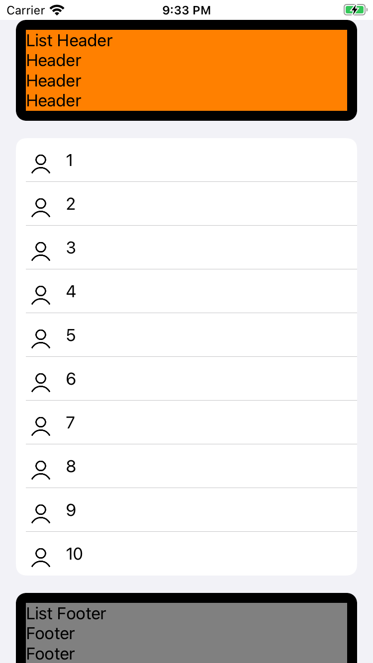
If you run the app now, you will see the layout like this which is very similar to earlier approach except we now have extra padding around supplementary views.
Adding Swipe actions to List view cells
After creating a list view, let's add some fun action to it. Here we will add a swipe action to it. This (Or these in case you're adding multiple swipe action) swipe action will be displayed when user swipes the cell to the right.
Let's start with basic swipe action which when tapped will change the background of the cell label. To achieve this, we will add an empty swipe action which will be part of dataSource closure.
        dataSource = UICollectionViewDiffableDataSource
            <Section, Int>(collectionView: collectionView) {
                (collectionView: UICollectionView, indexPath: IndexPath,
                number: Int) -> UICollectionViewCell? in

                guard let cell = collectionView.dequeueReusableCell(
                        withReuseIdentifier: MyCellCollectionViewListCell.reuseIdentifier, for: indexPath) as? MyCellCollectionViewListCell else {
                    fatalError("Cannot create new cell") }

                let swipeAction = UIContextualAction(style: .normal, title: "Change Color") { [weak self] (swipeAction, swipeButton, completion) in

                    // Swipe action executed
                }
                cell.leadingSwipeActionsConfiguration = UISwipeActionsConfiguration(actions: [swipeAction])

                cell.label.text = "\(number)"
                return cell
        }
Let's add the actual code so that when this swipe action is executed, it will alternatively toggle the label background color between red and white. We will first write the code and then I will add relevant instructions on how this code exactly works.
....

// Declared on the top in file scope
var indicesWithChangedColor: [Int] = []

......
....

    let changeColorAction = UIContextualAction(style: .normal, title: "Change Color") { [weak self] (action, swipeButton, completion) in
        guard let strongSelf = self else {
            completion(false)
            return
        }

        strongSelf.changeColor(identifier: number)
        completion(true)
    }
    cell.leadingSwipeActionsConfiguration = UISwipeActionsConfiguration(actions: [changeColorAction])

......
....

    private func changeColor(identifier: Int) {
        if let indexPath = dataSource.indexPath(for: identifier) {
            if let cell = self.collectionView.cellForItem(at: indexPath) as? MyCellCollectionViewListCell {
                if indicesWithChangedColor.contains(identifier) {
                    indicesWithChangedColor.remove(identifier)
                    cell.label.backgroundColor = .white
                } else {
                    indicesWithChangedColor.insert(identifier)
                    cell.label.backgroundColor = .red
                }
            }
        }
    }

....
.....
UIContextualAction initializer
UIContextualAction takes in three parameters. First parameters indicates if it is destructive or normal action. Destructive actions are those which delete or remove existing item from the list. Second, it takes a string which acts as a title for swipe action
If you're making your app available in diverse geographical locations, please make sure to localize this string
This parameters is called handler for UIContextualAction. This is a closure which gets called as soon as swipe action is triggered. It returns three parameter,
UIContextualActionUISwipeActionStandardButton- A button for triggering swipe actionCompletion- This closure is used to notify the caller that we successfully executed the task following swipe action by passing thetrueboolean value. If for some reason task cannot be executed, we passfalseboolean value to indicate swipe action failed
In above example, when swipe closure is called, we first check whether the valid instance of self exists in the closure. If the owner of this closure is nil, we call completion(false) indicating failure to execute swipe action. If owner exists, we execute follow-up action (Like changing the color of cell label) and indicate success by calling completion(true).
Modifying the background color of cell label
Our goal in this exercise is to toggle the background color cell label between red and white. When swipe action is executed first, we will change the color from white to red. When it's executed second time, we will change the color back to white from red and so on.
In order to maintain the state we will use the set named indicesWithChangedColor to store all the indices with changed color. When swipe actions is executed, we check following two conditions
- If identifier associated with that cell already exists in the set, we will remove it and change the background color of label to white
- If identifier associated with that cell does not exist in the set yet, we will insert it into the set and change the background color of label to red
If you run the app now, you will be able to swipe cells to the right and toggle label background colors
Of course, you creativity isn't limited to just one swipe action. You can add more than one swipe action depending on the functionality of your app and desired user experience originating from this interaction
Adding Accessories to List view cells
Lastly we will add some accessories to our collection view cells. Just for the demo purpose we will add two basic accessories,
- Outline disclosure - Disclose more content or reveal the cell children
- Delete - Delete or destroy the cell
Accessories can be assigned to cell by creating an array of UICellAccessory objects and assigning it to accessories property of cell.
    cell.accessories = [
        .outlineDisclosure(displayed: .always, actionHandler: {
            print("Handling Disclosure Tap")
        }),
        .delete(displayed: .always, actionHandler: {
            print("Handling Delete action")
        })
    ]
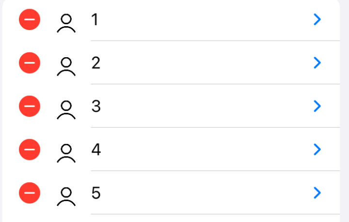
For the demo purpose I am always displaying these accessories. But there are some accessories (Such as Delete) we want to hide until user is in edit mode. You can easily control it by modifying above code as follows,
    cell.accessories = [
        .outlineDisclosure(displayed: .always, actionHandler: {
            print("Handling Disclosure Tap")
        }),
        .delete(displayed: .whenEditing, actionHandler: {
            print("Handling Delete action")
        })
    ]
Accessories provide actionHandler in the initializer. These handlers are called when user taps on them. For now, we are just printing what kind of actions will be executed, but you can incorporate complex business logic to trigger state changes and subsequent side-effects.
And that's all for today, folks. You can download the source from GitHub repository. Please make sure to switch to branch collection-view-lists-demo. If you have any questions, please reach out to me directly through comments section and if you have any suggestion for an improvement to the code, feel free to spin up a pull request


