How to Apply Global Styling in SwiftUI Apps


Although not strictly required, it's good to have a basic understanding of creating custom Environment Keys in SwiftUI. If you haven't already read it, I strongly recommend you to go through my previous blog article about creating a custom environment key-value pair in SwiftUI so that you will get more context from the post I am about to write
Introduction
In today's post, I am going to talk about how to apply the global style to the app with one click with the help of EnvironmentKey protocol. Often time we need to apply different styles to the app which may include fonts, colors, and icons that cater to specific users or app environments. Before SwiftUI, we had to maintain a global state and manually apply styles to the app.
Now with custom environment keys created using EnvironmentKey protocol, we can instantly change the whole app layout by updating styles associated with the current environment and automatically propagating that change to everywhere in the app that is using these styles to design the layout.
At the end of this tutorial, you will have a better understanding of,
- Creating a custom environment key
- Creating and updating custom styles on the fly
- Updating custom environment properties
Creating Custom Environment Key
In the first step, we will create a struct that represents a custom environment key. We will add required properties to it and update it on the fly as per the requirement - In this case, we will add a computed property called styling that represents the current app style.
First, we will create a Styling struct that represents app styles such as spacing, colors, icons, etc.
import Combine
import SwiftUI

struct Styling: Identifiable, Hashable {
    let id = UUID()

    var spacing: Spacings
    var colors: Colors
    var icons: Icons
    var fonts: Fonts
    var title: String

    init(spacing: Spacings = Spacings(), colors: Colors = Colors(), icons: Icons = Icons(), fonts: Fonts = Fonts()) {
        self.spacing = spacing
        self.colors = colors
        self.icons = icons
        self.fonts = fonts
        self.title = "Marigold"
    }
}
This struct represents a custom style applied from the app. We will add four core styles components as follow,
- Marigold
- Sunflower
- Brinjal
- default style (Same as Marigold)
extension Styling {
    static var `default` = Styling()

    static var marigold = Styling()

    static var sunflower: Styling = {
        var styling = Styling()
        styling.colors = Colors()
        styling.colors.background = .green
        styling.colors.subText = styling.colors.yellow
        styling.colors.text = .red
        styling.icons.homePageIconName = "paperplane.fill"
        styling.icons.stylePageIconName = "tray.2"
        styling.title = "Sunflower"
        return styling
    }()

    static var brinjal: Styling = {
        var styling = Styling()
        styling.colors = Colors()
        styling.colors.text = .purple
        styling.colors.subText = styling.colors.purple
        styling.colors.background = styling.colors.yellow
        styling.icons.homePageIconName = "bookmark.fill"
        styling.icons.stylePageIconName = "person.circle"
        styling.title = "Brinjal"
        return styling
    }()
}
Next, we will create a custom environment key conforming to EnvironmentKey protocol. To satisfy the protocol conformance, the struct needs to implement the following property,
static var defaultValue: Self.Value { get }
We want to use the default style when no style is assigned. So we will use the default Style initializer to create a style struct with default style values and assign it to defaultValue on the custom environment key.
struct StylingEnvironmentKey: EnvironmentKey {
    static var defaultValue: Styling = Styling()
}
We will add a computed property styling on the built-in type EnvironmentValues which can be written to and read from using getter and setter. This will be used to read and write custom styles to the newly created environment key.
extension EnvironmentValues {
    var styling: Styling {
        get { self[StylingEnvironmentKey.self] }
        set { self[StylingEnvironmentKey.self] = newValue }
    }
}
When you create a new view, you may need to assign custom styles to the current environment variable before presenting it to the user. If you don't specify anything, it will use the default styles. In order to facilitate it, we will add a utility function by creating an extension on the View type.
extension View {
    func setStyling(_ value: Styling) -> some View {
        environment(\.styling, value)
    }
}
Using this extension, you can assign any styles you want to the custom view using the following one-liner,
HomeView()
    .setStyling(.brinjal)
Creating Structs for custom Colors, Spacings, Fonts, and Icons
Before we jump into applying styles, we need to create custom structs for our styles. These include the following components,
- Spacings
- Colors
- Fonts
- Icons
We will also add a couple of utilities to convert SwiftUI Color type into UIKit UIColor type
//Spacings.swift

import Foundation
import SwiftUI

struct Spacings: Hashable {

    static let _8: CGFloat = 8
    static let _12: CGFloat = 12
    static let _16: CGFloat = 16
    static let _20: CGFloat = 20

    init() {

    }

    var large: CGFloat {
        return Spacings._16
    }

    var medium: CGFloat {
        return Spacings._12
    }

    var small: CGFloat {
        return Spacings._8
    }

    var margin: CGFloat {
        return Spacings._20
    }
}
//Colors.swift

import SwiftUI

struct Colors: Hashable {

    var background = Color(hex: 0xffddff)
    var text = Color(hex: 0x181A1B)
    var subText = Color(hex: 0x94999E)
    var tintColor = Color.red

    var yellow = Color.yellow
    var purple = Color.purple

    var navyBlue = Color(hex: 0x3D73CD)
    lazy var primary = navyBlue

    init() {

    }
}

// Color + Utilities
extension Color {
    init(hex: UInt) {
        self.init(
            red: Double((hex >> 16) & 0xff) / 255,
            green: Double((hex >> 08) & 0xff) / 255,
            blue: Double((hex >> 00) & 0xff) / 255,
            opacity: 1.0
        )
    }

    var uiKitColor: UIColor {
        UIColor(self)
    }
}
//Fonts.swift

import SwiftUI

struct Fonts: Hashable {

    var title: Font = Font.system(.headline)
    var bodyFont: Font = Font.system(.body)

    init() {

    }
}
//Icons.swift

import SwiftUI

struct Icons: Hashable, Identifiable {

    var homePageIconName = "checkmark.circle.fill"
    var stylePageIconName = "smallcircle.fill.circle.fill"

    func hash(into hasher: inout Hasher) {
        hasher.combine(homePageIconName)
        hasher.combine(stylePageIconName)
    }

    var id: String {
        homePageIconName + stylePageIconName
    }

    var homePageIcon: Image {
        Image(systemName: homePageIconName)
    }
    var stylePageIcon: Image {
        Image(systemName: stylePageIconName)
    }

    init() {

    }
}
Creating a Custom Environment Object
Now that we have styles and custom environment key ready, let's start with the custom environment object with styling property that encodes all the appearance settings.
We will use the singleton instance of this class applicable to all views in the app.
import SwiftUI

final class PlantEnvironment {
    static var shared = PlantEnvironment()

	var styling: Styling

    init(styling: Styling = .marigold) {
        self.styling = styling
    }
}
In the above example, we are using the shared variable which represents the singleton of type PlantEnvironment. In case the app doesn't explicitly specify, we are using marigold as a default style.
We are expecting the whole app to change its appearance as soon as the style is changed. However, the above code only works on the SwiftUI views. Presumably, your app may also be making use of UINavigationBar APIs which will have no effect from the style change.
To apply styles to UIKit elements, we need to create an observer on styling property and update the navigation bar style as soon as a style change is detected.
The PlantEnvironment class looks like this after an update
import Combine
import SwiftUI

final class PlantEnvironment: ObservableObject {
    static var shared = PlantEnvironment()

    @Published var styling: Styling

    private var stylingCancellable: AnyCancellable?

    init(styling: Styling = .marigold) {
        self.styling = styling
        updateAppearances(with: styling)

        stylingCancellable = $styling.sink {
            self.updateAppearances(with: $0)
        }
    }

    private func updateAppearances(with styling: Styling) {
        let backgroundColor = styling.colors.background.uiKitColor
        let titleColor = styling.colors.text.uiKitColor
        let tintColor = styling.colors.tintColor.uiKitColor
        let titleFont = UIFont.boldSystemFont(ofSize: 25)
        let largeTitleFont = UIFont.systemFont(ofSize: 34)

        let navigationAppearance = UINavigationBarAppearance()
        navigationAppearance.configureWithOpaqueBackground()
        navigationAppearance.backgroundColor = backgroundColor

        navigationAppearance.titleTextAttributes = [.foregroundColor: titleColor, .font: titleFont]
        navigationAppearance.largeTitleTextAttributes = [.foregroundColor: titleColor, .font: largeTitleFont]

        UINavigationBar.appearance().standardAppearance = navigationAppearance
        UINavigationBar.appearance().compactAppearance = navigationAppearance
        UINavigationBar.appearance().scrollEdgeAppearance = navigationAppearance

        UINavigationBar.appearance().tintColor = tintColor

        for window in UIApplication.shared.windows {
            for view in window.subviews {
                view.removeFromSuperview()
                window.addSubview(view)
            }
        }
    }
}
We will call updateAppearances the first time when the PlantEnvironment object is instantiated and then every time after styling is changed.
We also need a utility to assign the current style the styling key associated with the environment and by default pass the PlantEnvironment to SwiftUI views in the form of EnvironmentObject.
extension View {
    func plantEnvironment(_ plantEnvironment: PlantEnvironment = .shared) -> some View {
        self
            .environment(\.styling, plantEnvironment.styling)
            .environmentObject(plantEnvironment)
    }
}
Using this utility, you can apply any style and pass the pre-defined PlantEnvironment object to view before it is presented to the user. That way, the view will style itself using the style property defined in the current plant environment object.
This utility can be used on any view using the following syntax. By default, we will use the shared singleton instance of PlantEnvironment
HomeView()
    .plantEnvironment(.shared)
Building an app with Custom Styles and Environments
Now that our foundation is ready, we will create an app that will make use of custom styles and a global environment that will globally apply styles to all parts of the app as long as that screen is using the styles associated with the custom PlantEnvironment object in the form of EnvironmentObject.
First, we will create a top-level view that will use the shared singleton object of type PlantEnvironment and implicitly pass it down to all its children.
import SwiftUI

@main
struct GlobalStylingApp: App {

    @StateObject var plantEnvironment: PlantEnvironment = .shared

    var body: some Scene {
        WindowGroup {
            NavigationStack {
                HomeView()
            }
            .plantEnvironment(plantEnvironment)
            .navigationBarTitleDisplayMode(.inline)
            .background(plantEnvironment.styling.colors.background)
        }
    }
}
Children can reference, access, and use the styles associated with this passed object by referring to it with the following line,
@EnvironmentObject var plantEnvironment: PlantEnvironment
on the top level of the file.
As long as the plantEnvironment object is passed to the view, you can access the styles and apply color, spacing, and images associated with it to the corresponding view.
import SwiftUI
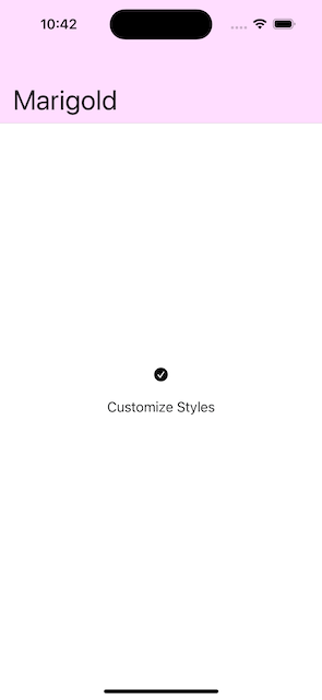
struct HomeView: View {
@EnvironmentObject var plantEnvironment: PlantEnvironment
var body: some View {
VStack {
plantEnvironment.styling.icons.homePageIcon
NavigationLink {
} label: {
Text("Customize Styles")
.foregroundStyle(plantEnvironment.styling.colors.text)
.padding()
}
}
.navigationTitle(plantEnvironment.styling.title)
}
}
If you run the app now, you will see the default marigold style applied to the home screen.
Changing Styles
So far we saw how to create custom environment keys and styles that can be applied throughout the app. In this section, we will see how to update app styles on the fly and verify those changes.
We will use the SegmentedPicker to allow users to choose any style they want. As soon as the style choice is made, we will assign the chosen value to the styling property on plantEnvironment environment object passed to this view.
@EnvironmentObject var plantEnvironment: PlantEnvironment

Picker("Picker", selection: $plantEnvironment.styling) {
    Text("Marigold")
        .tag(Styling.marigold)

    Text("Sunflower")
        .tag(Styling.sunflower)

    Text("Brinjal")
        .tag(Styling.brinjal)
}
.pickerStyle(SegmentedPickerStyle())
We are assigning the tag to each of the segmented picker choices. As the user makes the choice, it will take the chosen value and automatically assign it to styling property on the plantEnvironment object.
With this main portion ready, let's create a style view from where user can change styles and add navigation to it from the home screen,
//StyleView.swift

import SwiftUI

struct StyleView: View {

    @EnvironmentObject var plantEnvironment: PlantEnvironment

    var body: some View {
        VStack {
            Text("Customize Styles")

            plantEnvironment.styling.icons.stylePageIcon

            Picker("Picker", selection: $plantEnvironment.styling) {
                Text("Marigold")
                    .tag(Styling.marigold)

                Text("Sunflower")
                    .tag(Styling.sunflower)

                Text("Brinjal")
                    .tag(Styling.brinjal)
            }
            .pickerStyle(SegmentedPickerStyle())
            }

        }
        .padding()
        .navigationTitle(plantEnvironment.styling.title)
    }
}
Navigating from the Home screen
//HomeView.swift

NavigationLink {
    StyleView()
} label: {
    Text("Customize Styles")
        .foregroundStyle(plantEnvironment.styling.colors.text)
        .padding()
}
Now let's run the app and observe styles changes as the user toggles between available choices,
Verifying Styles Changes
To make sure our style changes get propagated everywhere in the app, we will add a navigation link to StyleView screen which will take us further to the styles demo screen where we will be able to see all the changes associated with the current ly applied style.
Navigation from StyleView.swift screen
......
...

Picker("Picker", selection: $plantEnvironment.styling) {
    Text("Marigold")
        .tag(Styling.marigold)

    Text("Sunflower")
        .tag(Styling.sunflower)

    Text("Brinjal")
        .tag(Styling.brinjal)
}
.pickerStyle(SegmentedPickerStyle())

NavigationLink {
    StyleUpdateDemoView()
} label: {
    Text("Tap to view updated styles")
        .foregroundStyle(plantEnvironment.styling.colors.text)
}

......
....
..
StyleUpdateDemoView.swift Screen
import SwiftUI

struct StyleUpdateDemoView: View {

    @EnvironmentObject var plantEnvironment: PlantEnvironment

    var body: some View {
        VStack {
            Text("Title")
                .foregroundStyle(plantEnvironment.styling.colors.text)
            Text("Subtitle")
                .foregroundStyle(plantEnvironment.styling.colors.subText)
        }
        .background(plantEnvironment.styling.colors.background)
        .navigationTitle(plantEnvironment.styling.title)
    }
}
Now let's run the app, change styles, and view style changes on all three screens.
Source Code
The full source code for this tutorial is available on the GitHub GlobalStyles Repo for further reference
Summary
So this was all about applying global styles in the iOS app using SwiftUI APIs. Hope you liked it and will be helpful for you to improve styles in your existing app. Have you used any other global styling framework? Do you have any suggestions for improvement in the current code or this blog post? Let me know. I would love to hear your thoughts on this topic.
Support and Feedback
If you have any comments or questions, please feel free to reach out to me on LinkedIn.
If you like my blog content and wish to keep me going, please consider donating on Buy Me a Coffee or Patreon. Help, in any form or amount, is highly appreciated and it's a big motivation to keep me writing more articles like this.
Consulting Services
I also provide a few consulting services on Topmate.io, and you can reach out to me there too. These services include,